Blog post
Priming-Based Onboarding: Convert Subscribers Before the Paywall
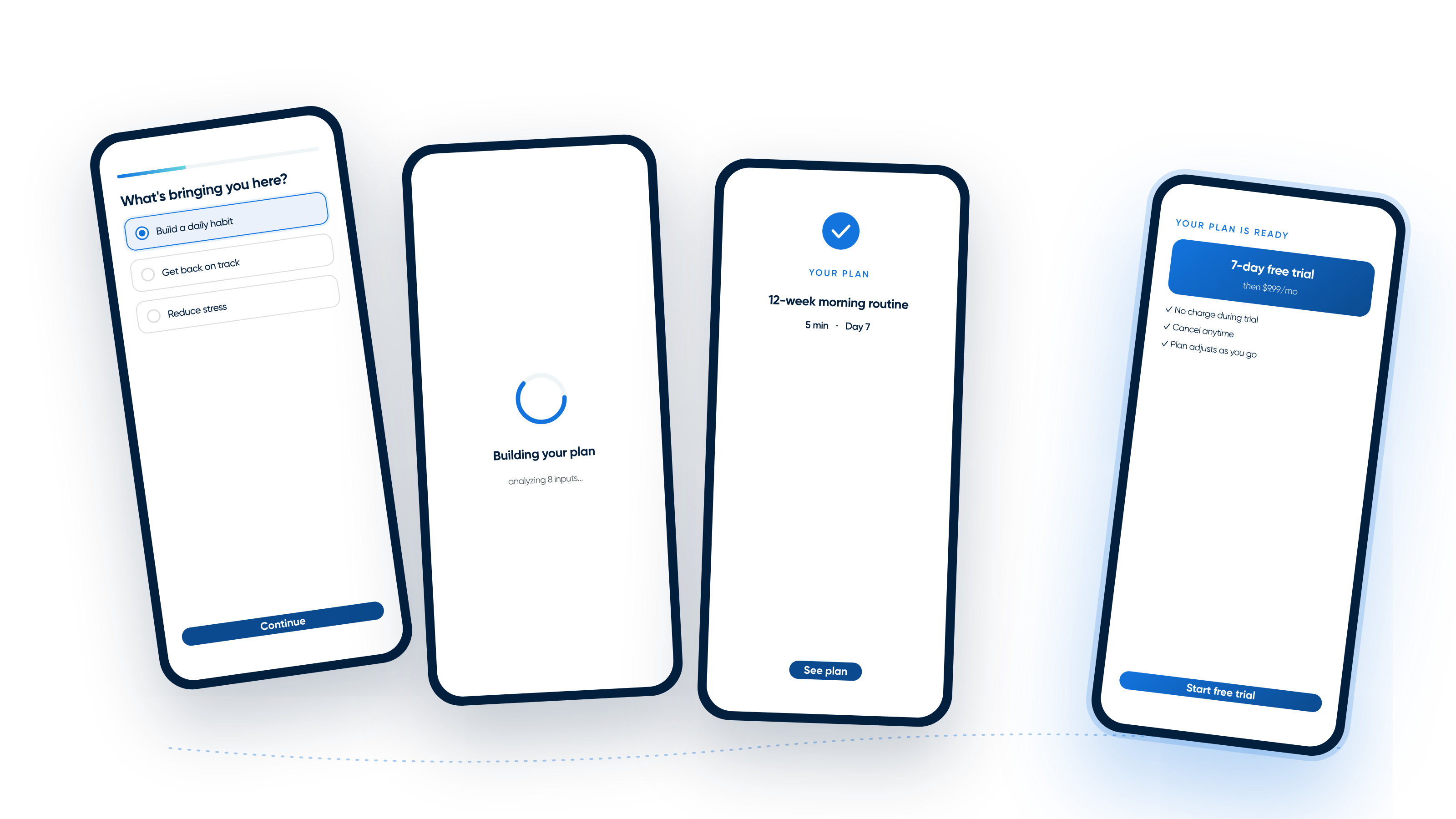
Most onboarding flows educate. The best ones prime subscribers to buy. Here's the psychology-backed framework for onboarding that converts.

Most onboarding flows educate. The best ones prime subscribers to buy. Here's the psychology-backed framework for onboarding that converts.

Most subscription teams ship ads, paywalls, and onboarding in isolation. Subscription orchestration is the practice of stitching them into one continuous, testable, optimizable subscriber journey.

Most teams optimize ads for clicks, not experience. Learn why post-click visibility breaks funnels and how to measure what happens after the click.

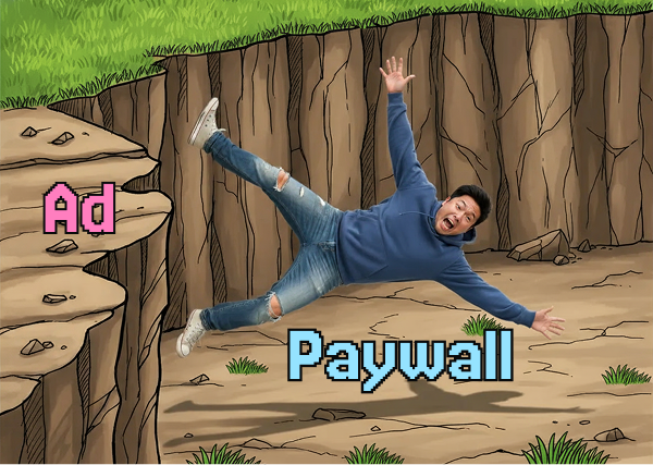
Repeated paywall exposure can reduce conversion and increase churn. Learn how paywall fatigue impacts subscription growth in 2026 and how teams can optimize against it.
Learn how deep linking from App Store and Google Play preserves user intent after install, connecting ads, store listings, and onboarding.
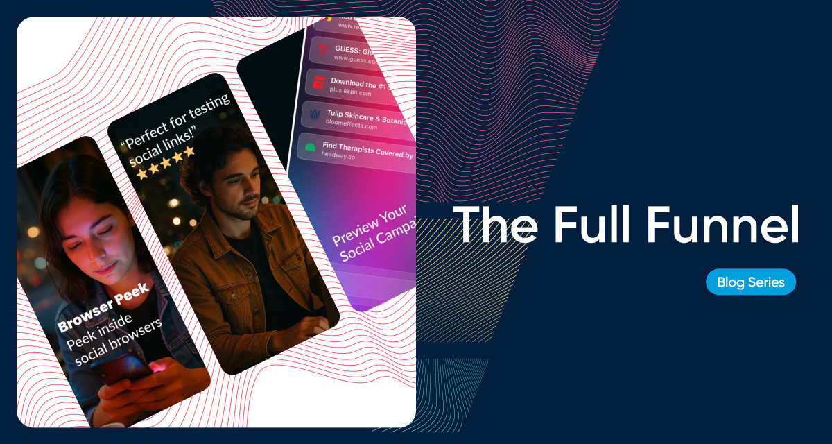
Learn how custom App Store and Google Play listings improve conversion by aligning ads, landing pages, and onboarding. Strategies, use cases, and real examples.

Subscription growth stalls when operations slow teams down. See how efficient systems increase experiment velocity, and deliver consistent customer experiences.
Most funnels drop users straight from ad to paywall. Learn how bridging marketing and product nurtures users, builds intent, and drives subscription growth.
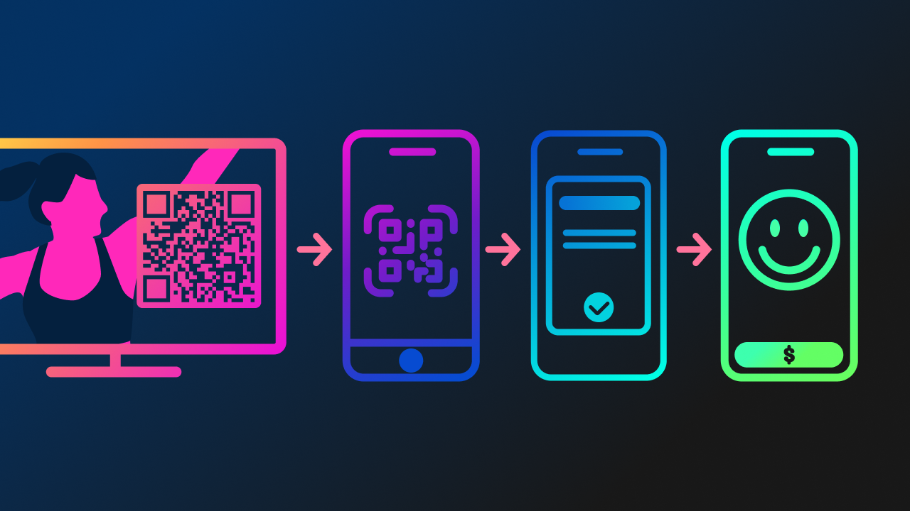
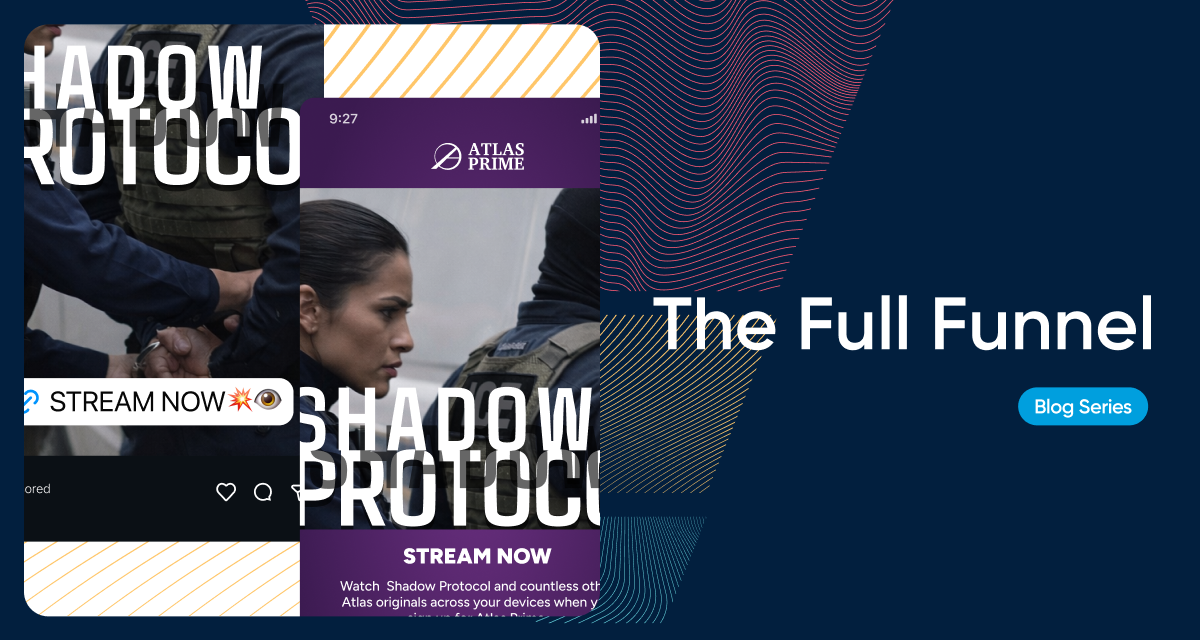
Interactive CTV ads with and without QR codes bridge awareness and conversion for subscription apps. Learn how TV campaigns at the top of the funnel connect to onboarding flows and paywalls for a seamless subscriber journey.
Strategy, product updates, and field notes on subscription orchestration — straight to your inbox.