With 15+ years in SaaS and digital innovation, Lindsay Giachetti helps enterprise product and marketing leaders turn subscription solutions into meaningful, revenue-driving experiences.
She has had the privilege of working with brands like Apple, Google, and Warner Media, shaping strategies that connect creativity, data, and technology. Today at Nami ML, Lindsay leads product marketing and partner engagement, helping enterprise teams grow smarter through personalization that scales.

Most teams aren’t using custom app store listings, despite the proven lift in conversion. Learn how targeted App Store and Google Play pages create a cohesive journey from ad to onboarding.
The companies behind app products are spending more than ever on acquisition, yet most users are sent to the same generic App Store listing. So few Google Play and App Store fronts are user-targeted that you might wonder:
With a product’s App Store listing living at the intersection of Product and Marketing, it’s no wonder there are missed opportunities in this gray area of the user journey.
Apple reports that developers see a 2.5 percentage point average increase when directing users to a Custom Product Page — a 156% improvement over the 1.6% average conversion rate on default product pages.
Most teams aren’t capturing that lift simply because they’re unaware these tools exist or they haven’t built workflows that allow Marketing and Product to collaborate on targeted store experiences.
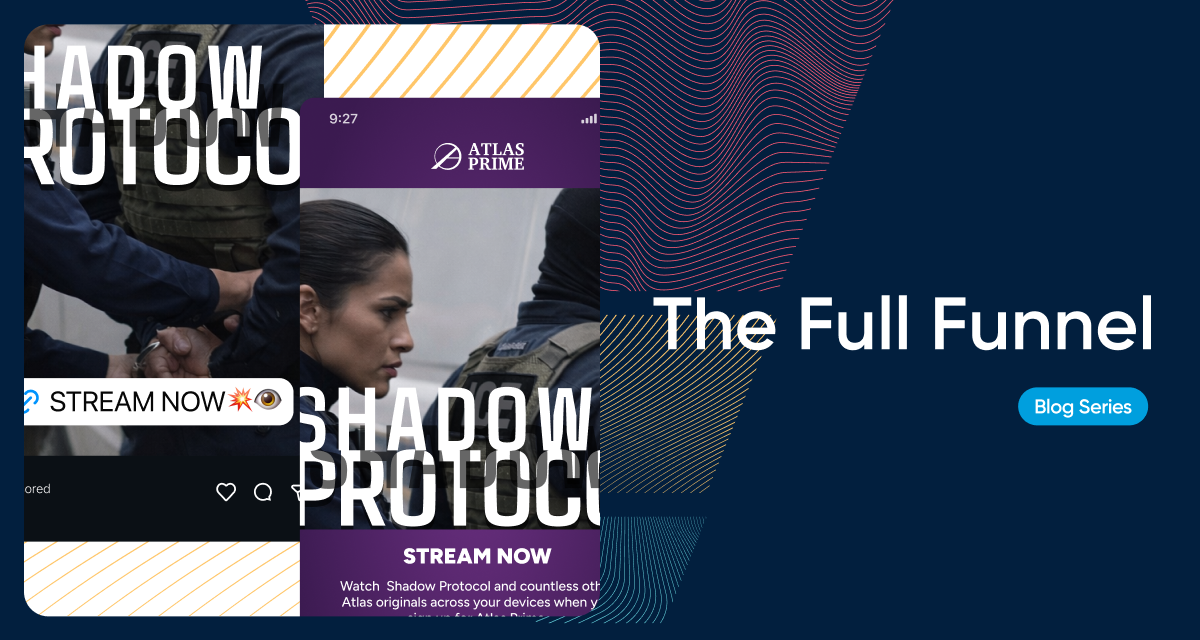
This is what a typical user journey might look like:
ad → store listing → onboarding
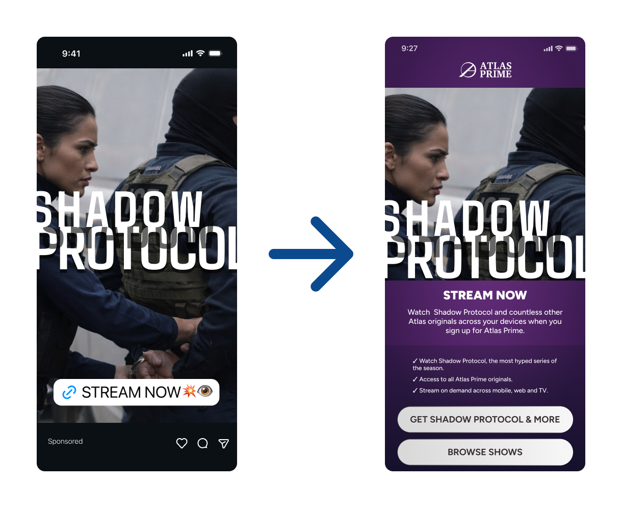
When a user moves from your tightly targeted ad or a relevant landing page into a generic App Store listing that treats every user the same, the disconnect creates friction at the exact moment their intent is highest. They just clicked the ad — they told you they’re interested.
Both Apple’s Custom Product Pages (CPPs) and Google Play Custom Store Listings (CSLs) allow teams to match the store experience to the path a user took. When messaging and visuals reflect their specific context, conversion becomes smoother and more consistent.
Every step, ad → store listing → onboarding, is part of a cohesive story.
Create additional versions of your app’s product page to highlight specific features or content, discoverable through unique URLs that you share. Add a deep link to direct people to a specific area of your app for a seamless experience. You can even use custom product pages in Apple Ads campaigns.
Users arrive at the store with intent shaped by the ad or link they clicked. When the screenshots and copy they see immediately reflect that scenario, you remove friction. The store becomes a natural continuation of the ad experience instead of a reset point.
Relevance is one of the strongest drivers of install performance. If you target pescatarians for a recipe app and your product page features a big, juicy steak, you just lost a subscriber. Conversely, someone coming in from an ad for protein-rich recipes will be very disappointed if you show them a zucchini wrap.
Custom App Store fronts let you match the listing to the mindset of the moment.
Paid campaigns often target niche audiences, creative angles, or funnel steps. A generic App Store page dilutes that precision. Tailored listing variants create continuity across the journey, improving install rate and lowering acquisition cost.
CPPs give teams clean attribution for testing different concepts or audience hypotheses. With purposeful variations in screenshots, video, or messaging, you can measure which narratives actually convert.
CPPs let you create up to 35 variations of your product page, each with its own URL. These variants can be used for paid acquisition, email, social campaigns, influencer partnerships, or any deep-linkable funnel.
1. App Preview Video
Each CPP can have its own video, showing different use cases, features, or platform contexts.
2. Screenshot Sets
You can customize:
3. Promotional Text
Short, high-visibility text you can update without a full release.
4. In-app Events (selection)
You can choose which in-app events to highlight on different pages.
Those elements stay consistent across all variants.
Google Play provides even deeper flexibility, with up to 50+ CSL variants. CSLs can target users by URL, country, language, install state, or specific acquisition channels.
1. Feature Graphic (hero graphic)
Prime real estate on Android. Can be customized per listing.
2. Screenshots
Like iOS, screenshots can be completely different for each variant.
3. Promo Video
Each variant can use its own video, hosted on YouTube.
4. Short Description
Visible above the fold. Extremely influential for conversion.
5. Long Description
Google allows changing the full description for each CSL.
6. App Name (for some targeting types)
In certain regional or device-specific variants.
7. Listing Details by User Type
You can show different listings to:
This supports re-engagement and lifecycle marketing.
| Element | Apple App Store (CPP) | Google Play (CSL) |
|---|---|---|
| Max Variants | Up to 70 | 50+ |
| Screenshots | ✔ Customizable | ✔ Customizable |
| Video | ✔ Customizable | ✔ Customizable |
| Feature Graphic | ✖ Not supported | ✔ Customizable |
| Short Description | ✖ Shared | ✔ Customizable |
| Long Description | ✖ Shared | ✔ Customizable |
| App Name | ✖ Shared | ✔ Sometimes (regional/variant) |
| Promo Text | ✔ Customizable | ✔ Short + Long description |
| Device-Specific Variants | ✔ (iPhone, iPad sets) | ✔ (varied targeting) |
| Target by Country/Language | Limited | ✔ Full control |
| Target by User State | ✖ | ✔ (new, lapsed, etc.) |
Below is a concise list of practical, high-impact use cases where custom App Store fronts drive meaningful results.
Different acquisition channels have different motivations and creative styles. Custom pages can reflect the environment users just came from.
Examples:
Tailoring screenshots to match the ad context reduces cognitive switching and keeps users anchored on the journey they started.
Other entry points may be mid-funnel, including:
If the App Store page mirrors that content, you reinforce the specific value the user is exploring. Depending on how you choose to set up your campaign, a user will likely have 1-2 touchpoints before getting to the product page. Here are some example journeys for targeted campaigns:
ad → store listing
comparison chart → store listing
ad → landing page → store listing
referral link → pricing page → store listing
Both CPPs and CSLs allow each variant to have its own URL, which gives marketers a controlled environment for experimentation. You can test different:
Because traffic goes to a specific listing version, attribution remains clean. This turns the App Store or Google Play listing into a measurable testing surface rather than a static asset.
This level of control is especially valuable in channels where small improvements in conversion rate have outsized impact on cost-per-install.
App Store fronts can shift with the calendar:
While broader than deep-link variants, these listings still benefit from tailored visuals that often outperform evergreen creative.
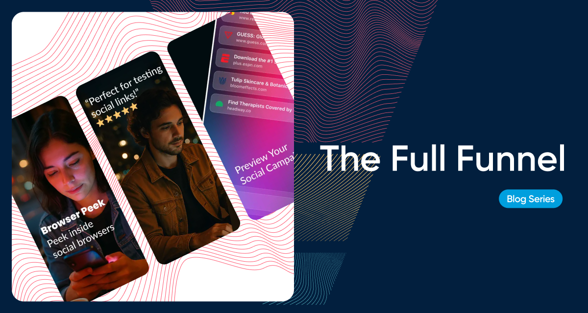
Perhaps the biggest opportunity in customizing store fronts is aligning creative with where a user first encounters a brand on their journey to the store. Arguably for most users that place is social media.
Using Nami’s Browser Peek — a tool that previews how funnel URLs render inside TikTok, Instagram, Facebook, and other in-app browsers — we created store listing variations based on traffic source.
Because Nami also handles Browser Peek’s onboarding flow, we extended this continuity into onboarding. The user’s journey stayed consistent from first click through install.
The app store is no longer the end of the journey. It’s the final commitment point before users see your product. If your team is investing in personalized acquisition paths, onboarding should reflect those expectations.
This is where tools like Nami Flow Builder complete the loop. After creating a tailored App Store or Google Play listing, you can carry that personalization into onboarding with contextual experiences, custom paywalls, or use-case-specific flows. The user moves from:
personalized ad → tailored store listing → aligned onboarding
The result is a conversion path that feels coherent from the first click to the first in-app action, increasing the likelihood of retention and trial success.
Teams typically begin with:
Extra credit: Extend the App Store experience into onboarding
Carry the same messaging and context into your onboarding flow so the journey remains aligned after install.
Marketers often see early wins even with simple changes that reflect the user’s platform, persona, or campaign theme.
Custom App Store fronts are no longer a nice-to-have. They’re a way to make every acquisition dollar more effective by meeting users with the context they carry in. When the store experience matches the journey, conversion lifts naturally.
For deeper guidance, examples, and technical instructions, refer to the official documentation:

Too many journeys skip the step that nurtures. Explore how bridging marketing and product creates cohesive experiences that convert more subscribers.
Imagine walking into a grocery store and finding the checkout right inside the door. There’s a basket of groceries waiting for you… it even has your name on it. But you didn’t pick any of it out. You don’t know what’s inside, how much it costs, or if it’s what you actually want. Do you really trust that what’s in that basket is for you if you didn’t do the shopping?
That’s what most subscription funnels feel like today: users click an ad, maybe they came in from TikTok or scanned a QR code on their TV, and are immediately presented with a paywall. They’re being asked to buy before they’ve had a chance to browse, explore, or understand the value.
That moment between ad interaction and purchase where intent is built, and ignoring it leaves potential subscribers behind.
To be fair it’s not just a user experience issue. It’s a symptom of how teams are structured. Marketing focuses on driving traffic and lowering acquisition costs. Product focuses on in-app experience and conversion. Between them lies a gap, and real subscription growth begins when marketing and product bridge it together.
When a user clicks an ad, they’re expressing curiosity, not commitment. They’ve seen a piece of marketing creative — an image, tagline, or video clip that captures their attention but doesn’t yet build their trust. If their next step is a demand for payment, it’s too much, too soon.
From the user’s perspective, the experience feels jarring. The visual style might not match. The offer might feel disconnected from the ad’s promise. The product’s value hasn’t been established, and the user’s psychological state hasn’t caught up to the ask.
The result: low conversion rates, high abandon rates, and wasted ad spend.
This is what happens when marketing and product operate on separate tracks. One optimizes for clicks, the other for purchases. No one owns what happens between them, which is the most psychologically sensitive part of the journey.
The path from first touch to subscription should be one continuous experience. Every step, from the ad creative to the landing screen to the paywall, should feel like part of the same story.
That requires marketing and product working as a single system.
When marketing and product aligns on the funnel experience, the result is a seamless journey that builds momentum instead of friction. Design, messaging, and flow come together to bridge curiosity and commitment.

Two psychological principles explain why direct ad-to-paywall funnels tend to underperform:
People crave consistency between what they see and what they experience. If the ad promises one kind of value — say, a clean, premium experience — but the landing page or app interface feels different, it creates dissonance. The user, usually subconsciously, begins to question whether they can trust what they saw.
A consistent experience, on the other hand, builds credibility. When the tone, visuals, and message flow naturally from ad to product, users feel reassured that they’re in the right place. Things make sense and the value they were promised is real.
Research in behavioral psychology shows that once someone takes a small action, they’re more likely to take a larger one later. This is known as the foot-in-the-door effect.
In subscription funnels, that means users who scroll, watch a short video, or interact with an experience before seeing a paywall are more likely to convert. Those micro-interactions build trust and momentum to create a sense of “I’m already in.”
When you send users straight from ad to paywall, you skip those psychological commitments. You ask for a decision before they’ve had time to decide.
Direct-to-paywall experiences aren’t disappearing — and they shouldn’t. They serve an important purpose: capturing high-intent users who are ready to act. For these users, removing steps and minimizing friction can drive immediate monetization.
But that approach only works for a small segment of your audience — the ones already convinced. For everyone else, the journey from curiosity to commitment needs more context.
That’s where landing flows come in.
Landing flows are connected, on-brand experiences designed to bridge the gap between marketing and product while engaging both high- and low-propensity users. Instead of sending everyone to the same paywall, a landing flow guides each user through a short, tailored sequence that builds intent before asking for payment.
Unlike a static landing page, a landing flow can:
The result is a funnel that works harder for every user type.
In combination, these journeys raise total conversion rates and reduce acquisition waste by matching the experience to the user’s readiness. Landing flows don’t replace direct-to-paywall paths, they complement them, capturing more value across the full spectrum of user intent.
Creating this kind of unified experience requires breaking down the invisible wall between marketing and product. That starts with shared ownership of the user journey.
Here’s what that looks like in practice:
When teams collaborate this way to bridge the gap between marketing and product, growth stops being a series of disconnected optimizations and starts becoming a single, cohesive system.
The most overlooked part of the subscription funnel is the middle — the journey between ad interaction and paywall. That’s where curiosity turns into conviction.
Bridging marketing and product isn’t just good alignment; it’s good business. It reduces wasted ad spend, raises conversion rates, and creates a brand experience that feels intentional at every touchpoint.
The companies that master this don’t simply acquire more users, they convert more of the right ones who are less likely to churn later on. Companies with cohesive product and marketing alignment understand that growth doesn’t come from louder ads or flashier paywalls. It comes from building a seamless, trustworthy journey that compels a user to follow.

Learn how interactive CTV ad campaigns at the top of the funnel connect to onboarding flows and paywalls for a seamless subscriber journey.
Connected TV (CTV) advertising has exploded as streaming audiences have shifted away from traditional linear TV. But what’s truly transforming the landscape is the rise of interactive CTV ads — those that invite the viewer to do something while watching. For subscription-driven businesses, this innovation opens up a powerful new top-of-funnel channel that connects awareness directly to conversion.
CTV is a natural extension of the subscriber journey — one that, when combined with informed onboarding and paywall experiences, creates a seamless, measurable path from big-screen exposure to paying user.
Interactive CTV ads enable viewers to engage directly with an advertisement using features like QR codes, remote clicks, polls, or shoppable elements. Instead of passively watching a brand message, the viewer can respond immediately — scanning a code, choosing an option, or even making a purchase without leaving the couch.
Unlike traditional broadcast spots, these ads are delivered digitally via streaming devices and Smart TVs (Roku, Fire TV, Google TV, Samsung, LG, and Apple TV). This means advertisers can leverage data targeting, performance measurement, and interactivity — capabilities once limited to web and mobile.
Below is a quick reference chart of the main interactive formats used in connected TV advertising today:
| Format | Description | Use Case for Subscription Apps |
|---|---|---|
| QR Code Overlay | A QR code appears on-screen, prompting viewers to scan with their phones. The scan leads to a landing page, mobile web, or app. | Ideal for driving viewers directly into a Nami-built onboarding flow or paywall experience. |
| Remote-Control Response | Viewers use their remote to interact — e.g., click “Learn More” or “Start Trial.” | Best for platforms with native interactivity (Roku, Fire TV) to capture immediate interest. |
| Shoppable / Carousel Ads | Displays multiple products or content options to browse via remote. | Could highlight subscription tiers, premium bundles, or exclusive offers. |
| Gamified / Poll Ads | Simple games, quizzes, or polls embedded in the ad to boost engagement. | Build awareness or preference profiles before serving a targeted trial offer. |
| Pause / Contextual Overlays | Ads triggered when the viewer pauses content or during contextual moments. | Unique brand awareness plays for publishers or streaming services. |

For subscription-based apps — streaming services, digital publishers, fitness platforms — CTV ads solve a long-standing problem: the gap between awareness and action.
Historically, TV advertising has been great for brand exposure but weak for direct conversion. With interactivity, a viewer can instantly move from watching a 30-second CTV ad spot to engaging with your service on their phone.
Consider the flow:
This creates a frictionless top-of-funnel-to-conversion journey — measurable, trackable, and consistent from the TV screen to the app experience.
Interactive features are expanding rapidly across connected TV platforms, and Roku may be ahead of the curve. Through Roku Ads Manager, advertisers can now create Action Ads — interactive units that let viewers engage with your brand directly from their Roku remote. Whether they’re requesting more information or shopping on the spot, these experiences illustrate how quickly CTV is evolving toward frictionless interactivity, where every viewer interaction can lead to a subscription or conversion.

Interactive CTV is growing fast:
For enterprise subscription brands, this means CTV is no longer just a branding play, it’s a performance marketing channel capable of driving measurable acquisition and retention.


Nami’s platform already powers the mid and bottom of the funnel — onboarding flows, paywalls, and subscriber analytics. Now, with interactive CTV ads feeding directly into those experiences, brands can own the entire subscriber journey:
CTV Ad → QR Scan or Embedded Interaction→ Nami Onboarding Flow → Nami Paywall → Subscription Experience
This unified approach ensures consistent messaging, streamlined UX, and clear attribution from first impression with an interactive CTV ad to recurring revenue. It’s the bridge between marketing and monetization, and it’s what modern subscription growth demands.
Ready to connect your next campaign from the big screen to the checkout screen?
Let’s talk about Nami’s CTV solutions for the subscriber journey.

Subscription orchestration is the practice of designing, testing, and optimizing subscriber journeys across channels and surfaces. Learn what it is, why it matters, and how it changes subscription growth.
Most subscription funnels include one or more of these elements: ads, landing pages, paywalls, and onboarding flows. Almost nobody connects them into a continuous experience.
Together, those elements are the subscriber experience layer - every part of the journey first impression to first payment.
Each element typically belongs to a different team and gets built in isolation. The ad team chases clicks, product may ship a paywall when engineering has capacity, and either team, or nobody, might be in charge of any experience in the middle of the funnel. Meanwhile the subscriber treks through a series of disjointed experiences, each one a chance to drop off.
This is the core problem in subscription growth. Rarely is there a thread from first impression through conversion, onboarding and into the product itself. Without anything unifying the subscriber experience, conversion suffers.
Subscription orchestration is the practice of connecting subscription funnel elements into one continuous, testable, optimizable subscriber journey across channels and surfaces.
If you have a subscription growth or product team, chances are you have very little insight into or say in what subscribers experience outside of your small section of the funnel.
Marketing may drive traffic but have no control over what happens after the click, or product handles the paywall but is blind to anything up the funnel. Or maybe product manages onboarding, but the preceding paywall is built by an outside vendor. While each team optimizes their funnel section, each is optimized in isolation.
This may be manageable for smaller businesses, but when you are at 100K+ subscribers, cracks show up fast.
Each handoff is a chance to drop off, and most subscriber experiences are full of them.
Between the ad that brings them in and the product they land in, subscribers pass through a series of moments, typically landing pages, paywalls, and onboarding flows. This is the experience layer. It contains every decision point where your subscriber chooses to keep going or bail.
The experience layer is where a transaction becomes a relationship. And for most subscription teams, it's the least systematic part of the entire operation.
Most subscription teams aren't managing this layer deliberately.
Subscription orchestration = intentionally managing the experience layer to create subscriber harmony
Subscription orchestration is the discipline of managing the experience layer intentionally. It covers the full subscriber journey from top to bottom of funnel: which landing page a subscriber sees, which paywall they're shown, which onboarding flow they enter, how those connect, and what logic personalizes each step. It includes the experiments that discover what converts and the coordination that keeps the experience consistent across every surface. The result is a coherent path that gives subscribers the best opportunity to stick with you.
In practice, subscription orchestration means a few specific things:
Landing pages, paywalls, and onboarding flows get the same deliberate design attention as ads and the product itself.
The whole journey from first impression to first payment is mapped and managed, not scattered across teams.
A/B and multivariate experiments run on ads, pages, flows, and onboarding. Winning variants stay and losing variants are pulled. Teams doing this well run hundreds of experiments per month across their subscriber experiences.
Subscription orchestration means the experience is consistent across all channels and surfaces, or intentionally different where the context calls for it. Ideally changes are launched universally as a single update.
Every design change, flow variation, and experiment result connects back to conversion, activation, and revenue. Teams see in real time which experiences are driving subscriber growth.
Three shifts are making subscription orchestration more urgent than it was two years ago:
As paid channels get more expensive, the ROI on converting traffic you already have goes up. A 12% improvement in conversion rate, achievable with structured experimentation on the experience layer, can outperform a 20% increase in ad spend.
Streaming and media companies aren't just managing iOS and Android anymore. They're managing Roku, Fire TV, Apple TV, Samsung, LG, and more. Each platform has different technical constraints and subscriber expectations. Without a unified system, teams end up building and maintaining subscriber experiences for each one independently.
3. Product and marketing teams need to move faster
The companies that iterate fastest on subscriber experiences win. When every page change requires a sprint and every experiment requires engineering, evolution stalls. Teams that go from idea to live experiment in hours instead of weeks have a compounding advantage.
Outcomes vary by company size and vertical, but the pattern is consistent:
Faster iteration. Teams go from concept to live subscriber experience in days, down from weeks or months. Product and marketing ship without engineering tickets.
More experiments, better results. With experimentation friction removed, teams run hundreds of experiments per month across subscriber experiences. More experiments mean faster learning, which compounds into higher conversion rates over time.
Cross-platform consistency. Subscriber experiences stay coherent across your entire subscription business.
Product and marketing alignment. Both teams work on the same implementation plan with the same journeys and the same data. The organizational gray area between "who owns the paywall" and "who owns the landing flow" gets a shared home.
If you're evaluating whether subscription orchestration fits your business, start with a few questions:
If the answer is weeks, the experience layer is your bottleneck.
Fewer than 50 likely means conversion revenue left on the table.
If your mobile paywalls and your CTV paywalls are built by different teams, orchestration can close the gap.
Nami is a subscription orchestration platform and subscription growth platform that gives product and marketing teams control over the experience layer across mobile, web, CTV, and more. If you want to see how it works for your growth and product teams, book a demo.

Most teams optimize ads for clicks, not experience. Learn why post-click visibility breaks funnels and how to measure what happens after the click.
Social media ad platforms are optimized to measure what happens on-platform: impressions, engagement, and click through rate. Marketing teams, in turn, optimize toward the clearest and fastest feedback signals available to them.
None of these metrics confirm, however, whether the down funnel experience, often a landing page or landing flow, was successful.
An ad can “perform well” even if the experience that follows is slow, interrupted, or fundamentally misaligned. When that happens, the platform continues to reward the ad for generating attention, even if that attention never had a chance to become real intent.
In other words, Meta or Tik Tok, or whatever other platform hosts your ad, is ambivalent about post-click performance and its narrow focus could be costing you.
Too often users effectively disappear after they click an ad.
They move from a highly observable environment into a post-click (or post-scan if coming from CTV) experience that sits outside of where most optimization decisions are made. Ad teams operate in environments optimized for speed. Decisions about creative, budget, and delivery are made quickly, based on signals that appear immediately. The first post-click experience, by contrast, is often owned by product or growth teams, measured in different tools, and reviewed later, if at all.
As a result, what remains actionable to the ad team is a thin layer of signal. They can see clicks, sometimes landing page views, though measurement is not always optimized, and eventually aggregate outcomes. What requires more comprehensive measurements and deeper understanding is whether users actually experienced the journey as intended in the moments that mattered most.
A lack of comprehensive insight creates a structural blind spot. When performance drops downstream, teams are forced to infer the cause from incomplete information. Messaging gets blamed. Creative is refreshed. Budgets get shifted. Meanwhile, the real issue may live entirely in the experience after the click.
Even sophisticated organizations fall into this pattern, not because of poor execution, but because ownership, measurement, and decision-making are fragmented at the exact point where intent is formed.
Until that gap is addressed, teams will continue optimizing around the black box rather than expanding their visibility.
Landing page performance is often reduced to a single question: Did it convert?... and conversion here, confusingly, does not necessarily mean conversion into a paying customer or subscriber.
Measuring ad performance requires an understanding of the full scope of landing page metrics and how they fit into the bigger picture.
To understand whether the post-click experience is actually doing its job and be able to repair any breaks in real-time, landing page performance needs to answer three questions: Was the experience delivered, did the user engage, and did the user move forward?
Measurement: Page views
Landing page views, as mentioned above, exist to answer this question. A meaningful gap between clicks and page views is not a messaging problem. It is a delivery problem. If you experience a noticeable difference between clicks and landing page views, it’s worth investigating possible slow load times, failed redirects, or in-app browser behavior that is preventing users from ever seeing the experience you designed.
It is also important that page views only include successful page views, so the measurement should occur once the user has the experience in view.
Measurement: Time on page, scroll depth, interaction
Once the experience successfully loads, the next question is whether users engage with it at all.
Engagement signals include time on page, scroll depth, or interaction with important content elements. These signals help distinguish between low intent and high friction. If users leave immediately without interacting, the experience may be confusing, interrupted, or misaligned with expectations set by the ad.
Measurement: conversion to next step
Only after delivery and engagement are confirmed does it make sense to look at progression. These signals indicate that the experience was not only seen and interacted with, but trusted enough to support a decision.
Directional outcomes are not final conversions. They are moments where a user actively chooses to move forward, such as viewing a paywall, starting a sign-up, or initiating a trial.
It’s important not to conflate landing page conversion with purchase or subscription conversion. They serve different purposes and answer different questions.
Without the full picture of a landing page’s performance, it is impossible to tell whether an ad is underperforming or whether the post-click experience is breaking the journey.
When teams lack this visibility, creative is often blamed prematurely, and ad teams are sent back to do unnecessary work while the real issue persists. These signals are most valuable when monitored as close to real time as possible so both ad and growth or product teams have actionable insights about what is and isn’t working with an ad funnel.
As ad platforms become more opaque and creative scales faster, the post-click experience carries more weight than ever.
If you can’t see what happens after the click, you’re not optimizing top-of-funnel, you’re guessing.
The future of top-of-funnel performance is not just better ads. It is better visibility into, and control over, what happens immediately after them.
This is the first step in a broader effort to rethink top-of-funnel performance through the lens of the post-click experience. Nami’s complete guide to social media ads for subscription funnels will go deeper into how these principles play out across major social platforms and how to optimize performance at the enterprise level.

Repeated paywall exposure can reduce conversion and increase churn. Learn how paywall fatigue impacts subscription growth in 2026 and how teams can optimize against it.
Most growth teams understand ad fatigue instinctively.
When a customer sees the same ad too often performance drops and they tune out. CPMs rise while returns fall. Social media platforms even bake this into their ad tooling through metrics like frequency (Meta) and fatigue (Tik Tok).
The same dynamic is playing out further down the funnel at the moment of conversion.
This is paywall fatigue.
Just as ad fatigue occurs when repeated exposure causes ads to lose effectiveness, paywall fatigue occurs when users are repeatedly exposed to the same paywall experiences, leading to disengagement, erosion of trust, and declining monetization performance.
The critical difference between ad fatigue and paywall fatigue, beyond their placement at opposite ends of the funnel, is visibility. Most growth teams actively monitor ad fatigue, but very few are watching for paywall fatigue.
This is not the same as price sensitivity or subscription fatigue. Users are still willing to pay for value. They’re just increasingly resistant to how that value is being presented.
Paywall fatigue is an experience problem, not a pricing one.
Several market forces are converging at once.
Users now manage dozens of subscriptions across media, fitness, productivity, finance, and entertainment. They are more discerning, more skeptical, and faster to abandon experiences that feel extractive.
Teams are under constant pressure to:
These tactics often backfire, especially at scale.
Many apps still rely on the same static paywall shown to every user, in every context, with the same message. Some may even leverage A/B tests or utilize a handful of personalized paywalls, but the paywalls themselves remain relatively static.
Monetization tools make it easy to test layouts and prices, but what about user intent, lifecycle stage, or downstream impact like churn and reactivation?
With larger user bases, small monetization inefficiencies compound quickly. What looks like a minor conversion dip in isolation can become a material revenue and retention risk when the same paywall experience is repeated at scale.
| Ad fatigue | Paywall fatigue | |
|---|---|---|
| Definition | Diminishing effectiveness caused by repeated exposure to the same ad | Diminishing effectiveness caused by repeated exposure to the same paywall |
| Primary surface | Social feeds, banners, pre-roll, native units | In-product experiences (web, mobile, CTV, console) |
| Funnel position | Top of funnel | Bottom of funnel |
| User reactions |
Scrolling past Tuning out / banner blindness Installing an ad blocker |
Instant closes Feature avoidance App uninstall or abandonment |
| Early warning signs | Falling CTR, rising CPC / CPM | Falling conversion lift, faster dismissals, shorter time to churn |
Common symptoms of Paywall fatigue include:
When this happens, adding more variants, more triggers, and more urgency only compounds the issue. Just like ad marketers have learned to treat ad fatigue as a valuable early warning signal, growth teams must listen to paywall fatigue and take appropriate action.
Across high-volume consumer apps, a few patterns show up repeatedly.
If a user hasn’t experienced meaningful value, a paywall feels like friction, not an opportunity. Early exposure can work, but only when value is implied or already demonstrated.
Seeing the same headline, same benefits, and same design across onboarding, feature access, and re-engagement trains users to ignore it.
A user who just completed a meaningful action is in a very different mindset than a user who just opened the app for the first time. Treating them the same leads to fatigue.
A paywall that converts well but produces short-lived subscribers is often labeled a “winner.” In reality, it’s borrowing revenue from the future.
When paywalls are static moments instead of part of a broader monetization journey, teams lose the ability to adapt over time.
If you're familiar with ad fatigue, paywall fatigue is measured the same way: by tracking frequency.
Frequency = Impressions ÷ Reach
In advertising, when frequency increases and performance declines, fatigue is setting in. The same pattern applies to paywalls.
While most teams track paywall views in aggregate, fewer look at exposure per user, which is where fatigue shows up first. That’s why it’s important to monitor both frequency and performance together to understand when paywall exposure stops helping and starts hurting.
Early warning signals of paywall fatigue:
The goal isn’t to minimize paywall exposure. It’s to understand when additional exposure stops adding value and starts causing damage.
Just as ad teams use frequency caps and creative rotation, mature monetization teams use paywall frequency to inform timing, variation, and refresh cycles.
The relationship between paywall frequency and performance mirrors what ad teams have seen for years. As exposure increases, conversion does not collapse immediately. Instead, it tapers off over time, a classic sign of fatigue.
The graph below illustrates this pattern, with paywall fatigue beginning around the orange dotted line. While fatigue isn’t a single moment, it marks the tipping point where additional exposure starts producing diminishing returns.
While the graph curve shows the pattern, you can look at the data to see where fatigue begins to set in.
By looking at conversion rate alongside frequency, you can identify the point where each additional paywall exposure results in a disproportionate decline in performance.
The table below shows how conversion rate declines as paywall frequency increases. In this example, performance begins to meaningfully degrade once frequency exceeds ~2 exposures per user. At that point, CTR drops sharply, with the marginal decline accelerating from roughly -0.11 to -0.40 per additional exposure.
Beyond this point, showing a user the same paywall no longer pays for itself.
Paywall fatigue begins when additional exposure stops adding value. It is important to refresh the experience for users before fatigue sets in.
As monetization matures, teams move from shipping a single paywall to operating a portfolio of paywall experiences, refreshed with the same rigor as ad campaigns.
| Immature | Maturing | Mature monetization | |
|---|---|---|---|
| Paywall strategy | One primary paywall used everywhere | A small set of paywalls mapped to key flows | A system of paywall experiences tailored to user behavior and lifecycle stage |
| Creative & messaging | Static copy and design shipped once | Occasional updates based on performance | Continuously refreshed creative and messaging like ad campaigns |
| Triggering | Aggressive early triggers | More thoughtful, rule-based placement | Context-aware triggers aligned to moments of value |
The teams seeing sustained subscription growth tend to follow a few core principles.
Paywalls perform best when they appear immediately after a user experiences something meaningful. This reinforces cause and effect rather than interruption.
Usage patterns, feature engagement, and intent signals are far more predictive than user attributes. Context-aware paywalls feel relevant instead of repetitive.
Different users care about different outcomes. Even the same user may care about different outcomes over time. Messaging should evolve accordingly.
Instead of hard stops everywhere, allow users to build momentum before escalating. This reduces friction while preserving revenue potential.
Track churn, retention, and expansion alongside conversion. A slightly lower conversion rate with materially higher LTV is often the better outcome.
The teams that survived the ad era learned a hard truth: more exposure does not equal more revenue. They invested in frequency control, creative rotation, relevance, and timing.
The future of monetization belongs to teams who treat paywalls at the bottom of the funnel as adaptive systems, not static screens.
And just like with ads, the teams who learn when to show less will ultimately earn more.