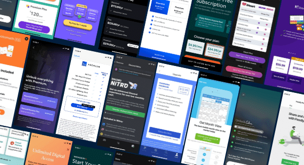

We’ve studied the paywalls of top subscription apps and found clear patterns in how they’re designed. Here are 20 types of paywall for mobile apps, with design patterns you can test to help improve your conversion rate.
Patterns aren’t a substitute for strategy — the right paywall pattern depends on what came before it (the ad, the onboarding moment, the feature wall) and what comes after (the trial, the renewal, the win-back). The teams that ship the highest-converting paywalls treat them as one screen in a coordinated subscriber journey. That practice is subscription orchestration, and it’s the lens to bring to the patterns below.
Featured Product Badge
Guide people toward a particular plan with this simple design pattern. Include a small tag or badge on top of or next to the product with text calling out why it’s the one to pick.
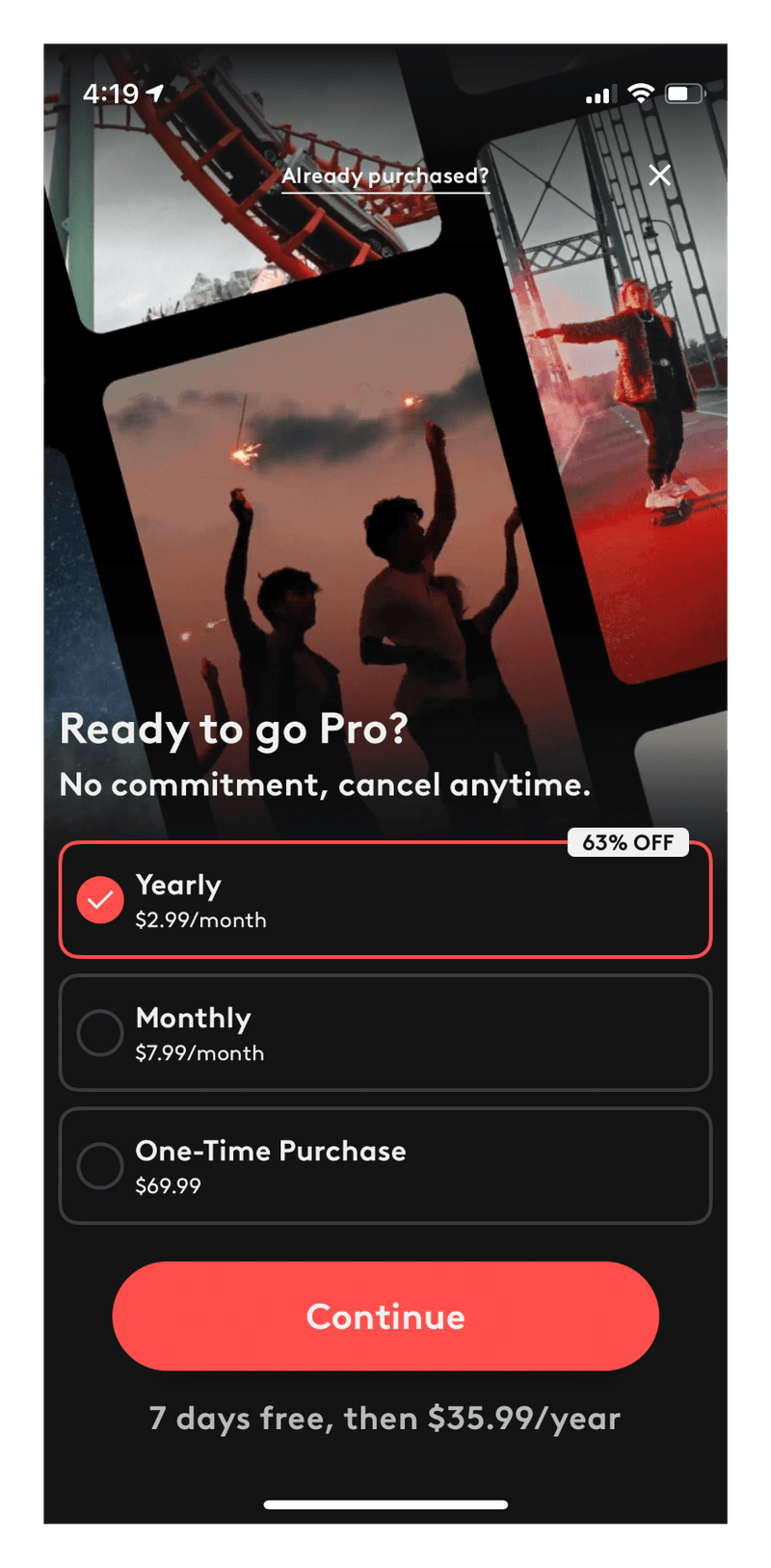
Videoleap
The Videoleap app includes a small badge showing the savings if you purchase an Annual Subscription.
Wattpad
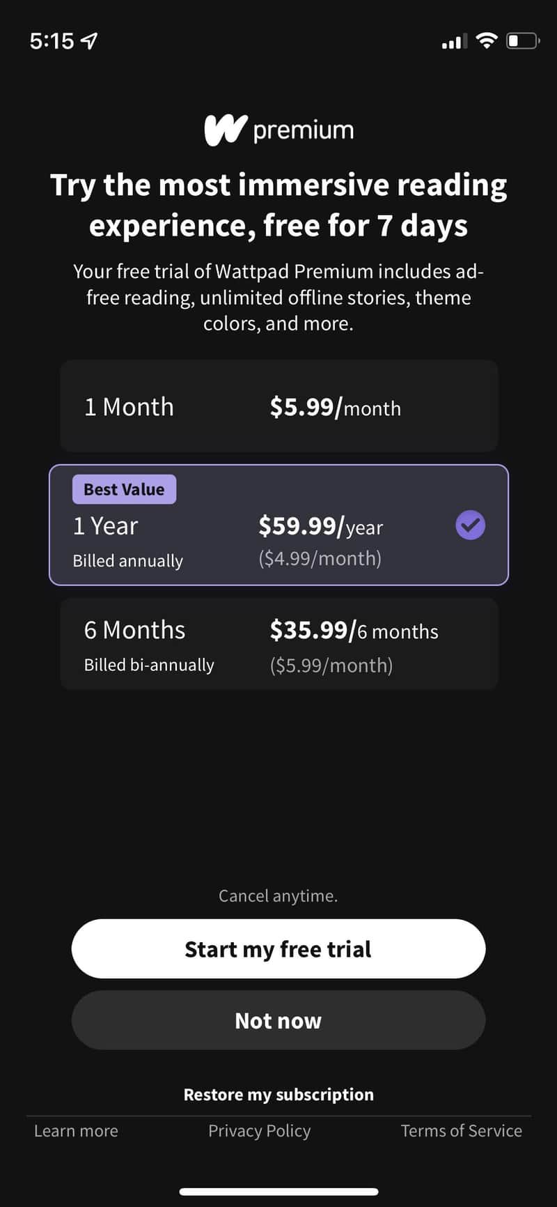
The Wattpad reading app uses a small ‘Best Value’ badge. Strategic use of their brand color helps to draw the eye towards the Annual Subscription.
List of Benefits
People love lists. Including bulleted lists of the benefits they’ll receive by upgrading from the free plan can be a great conversion tactic.
YouTube Music
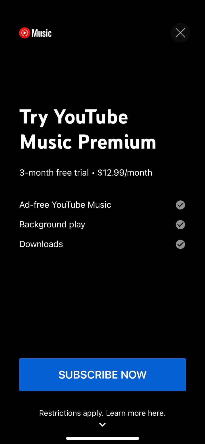
The popular YouTube Music app includes a list of benefits with just 3 bullets that are short and easy to read.
Canva
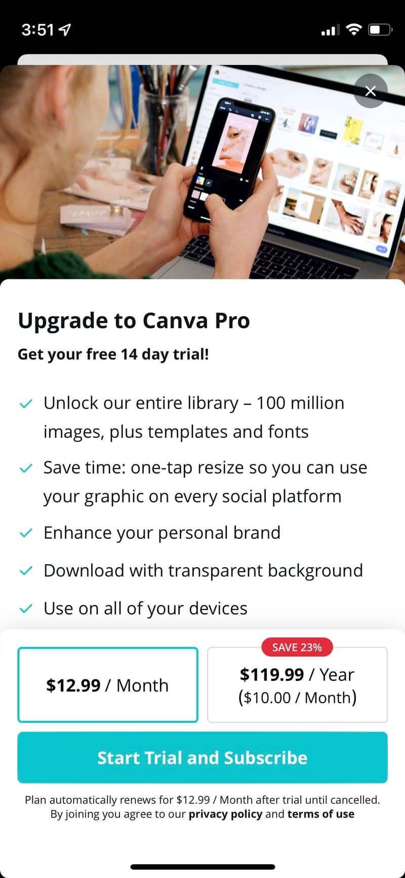
The Canva mobile app provides an enticing product image at the top of their paywall, and then shows a scrolling list of all Pro benefits.
BuzzFeed
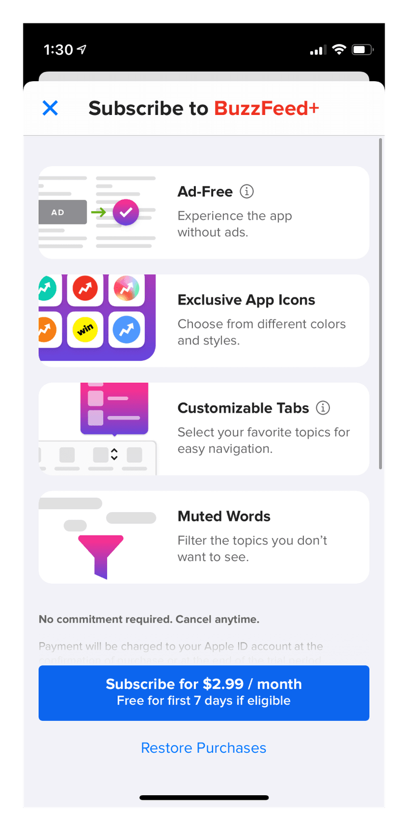
The Buzzfeed mobile app paywall shows a list of benefit cards with beautiful icons.
Carousel of Images
Mobile audiences love to swipe through images. Capitalize on this by including a simple carousel with images of your subscription experience. You can even mix images and text or app reviews in a carousel.
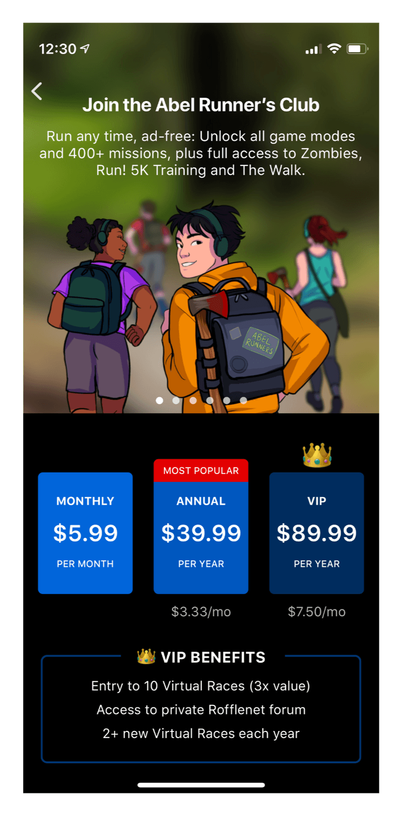
Zombies, Run!
This running app includes a fun carousel of illustrations.
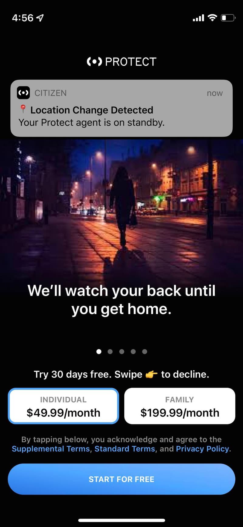
Citizen
The Citizen app smoothly embeds a carousel of text and images with real examples of features you will unlock.
Embedded Video
When thinking of paywall design elements, you don’t need to limit yourself to just static text and images. Video can be incredibly effective at representing the value proposition of your app, especially if your app is in the Photo & Video category.
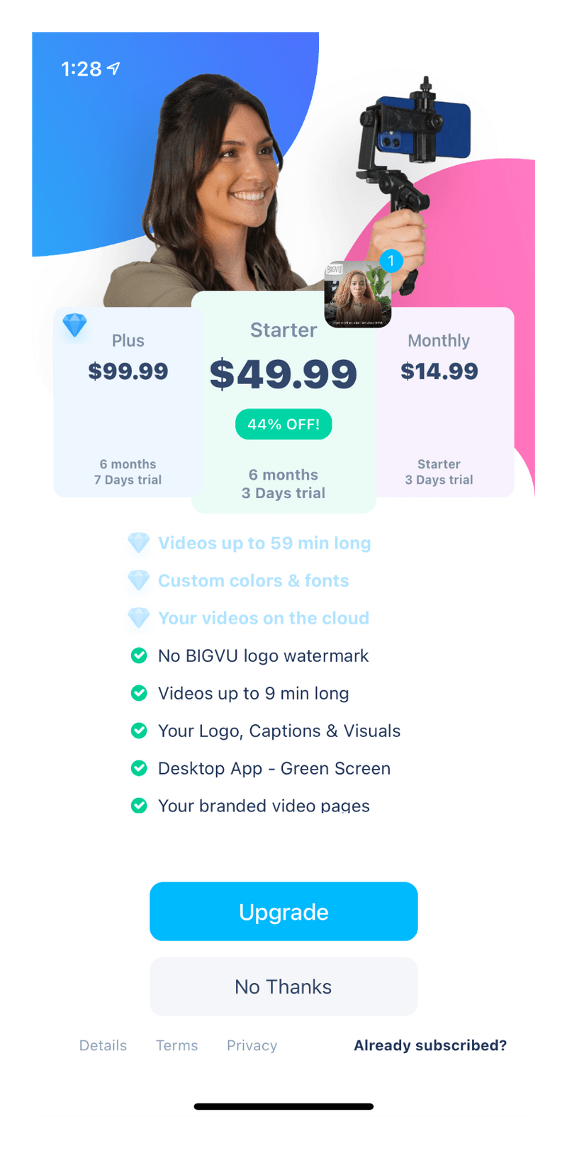
Teleprompter
This video teleprompter app includes a tiny embedded video thumbnail. This helps demonstrate the Premium experience without being too distracting.
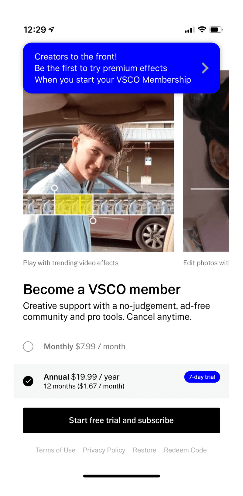
VSCO
This popular video editing app not only embeds video in their paywall, but embeds it in a carousel to really show off all the features of their app.
Dark Background
A simple black or dark gray background is one of the most popular paywall design patterns, particularly for Music or Entertainment apps.
Calm
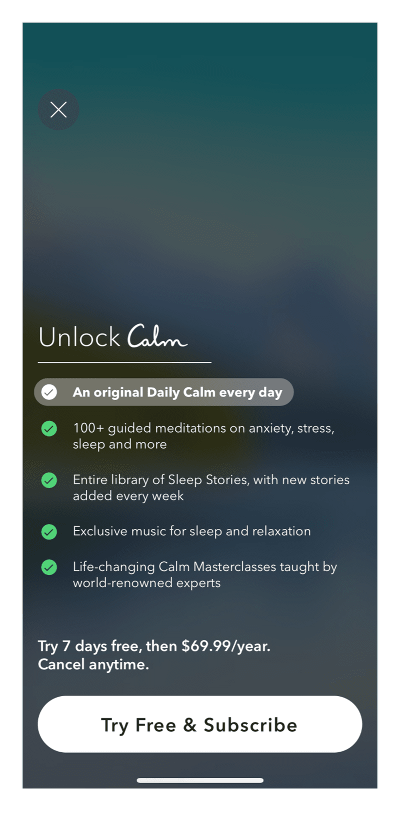
The award-winning Calm meditation app has a dark gradient background. This color makes their text and benefits list pop.
MasterClass
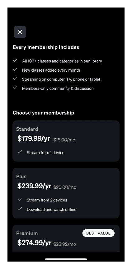
This app’s simple black and white color scheme gives a professional and elegant vibe.
Tiered Plan
A tiered plan can be very effective when building a dedicated subscriber base. Introduce people to the app on the ‘basic’ tier, then promote the ‘premium’ plan to your most engaged.
Paramount+
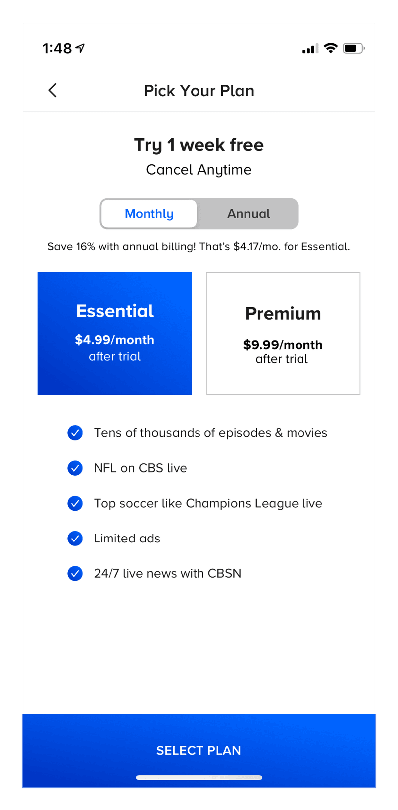
The Paramount+ streaming app shows side-by-side plan options. Clicking each plan shows pricing and the list of benefits.
The Washington Post
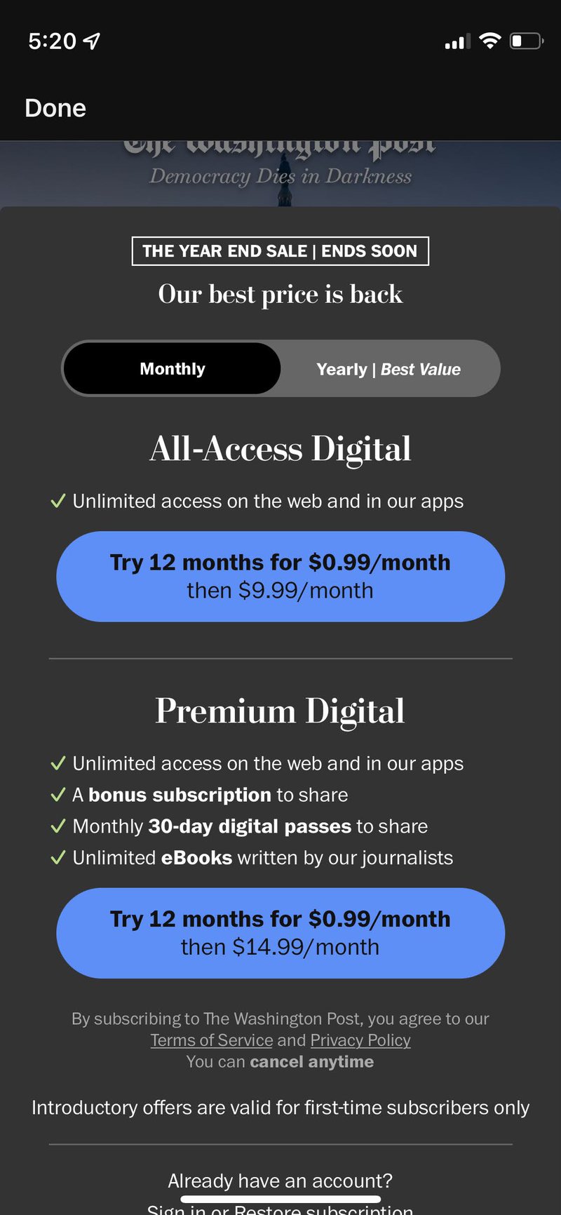
Washington Post’s paywall includes 2 tiers of plan. A simple checklist shows you the difference in the 2 plans.
Reviews
Including reviews from satisfied subscribers is a great paywall design pattern that uses social proof to drive new purchases.
Flo
The Flo Period tracker app includes reviews from other women, incorporated into the carousel of benefits. Check out this glowing review!
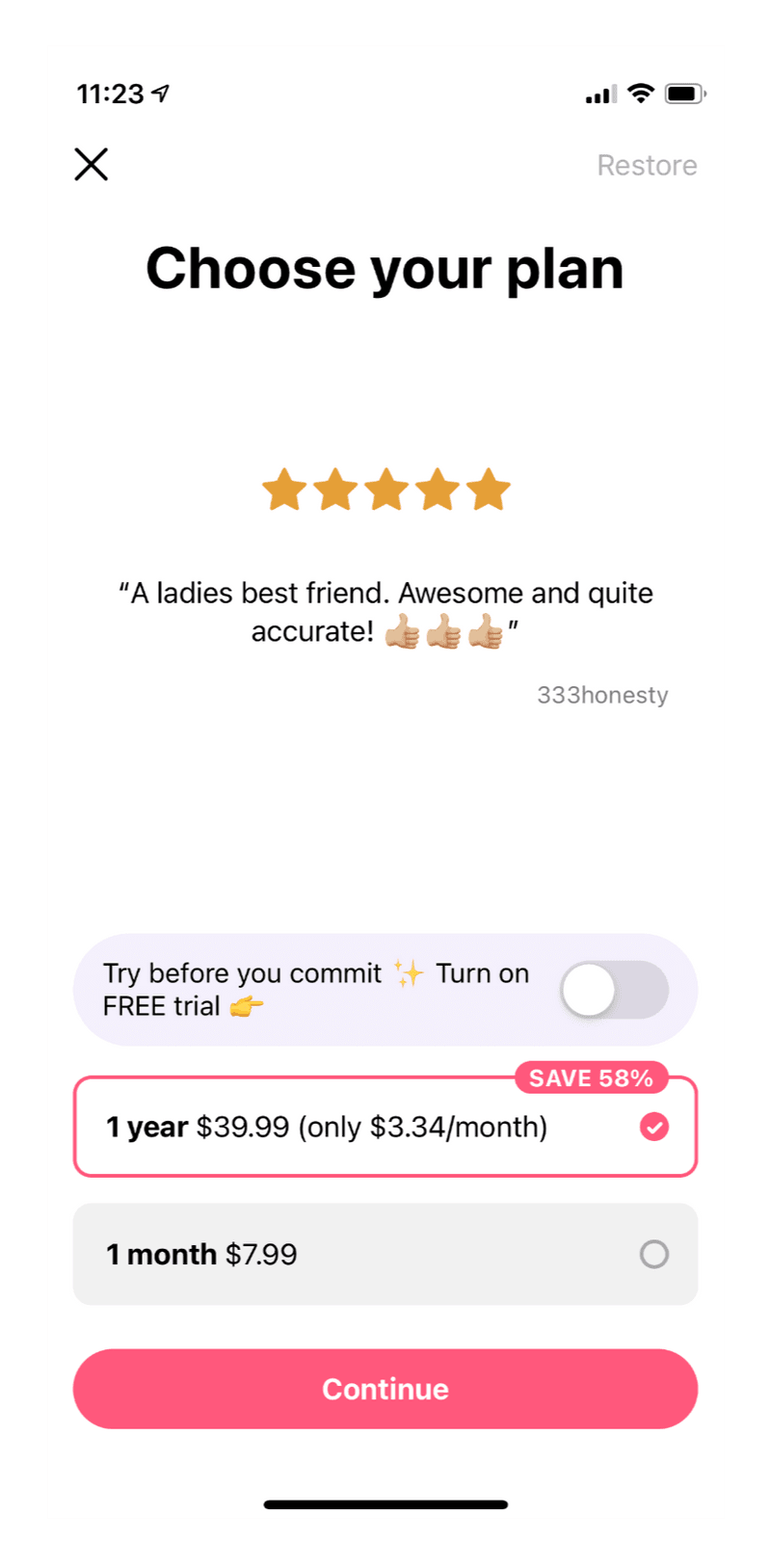
Soosee
The Soosee app includes user avatars to give reviews an even more personal touch.
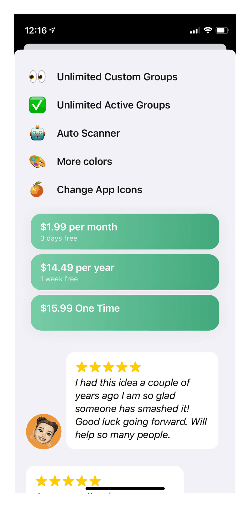
Horizontal Product Buttons
Product buttons are often displayed in a vertical list, stacked on top of each other. But a horizontal product list is one of the most popular paywall design patterns because it encourages people to compare offers.
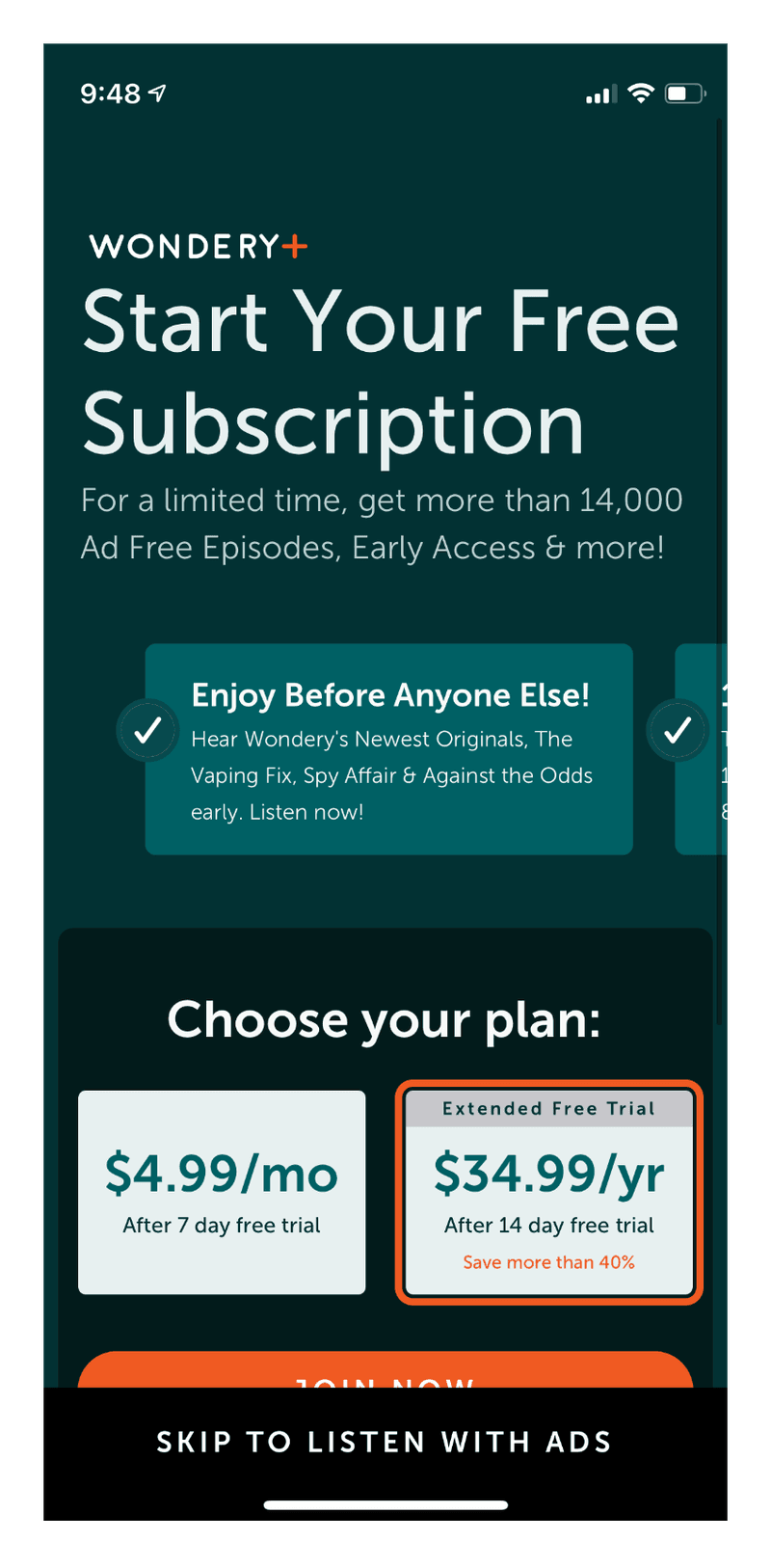
Wondery
This popular Amazon-owned podcast app features 2 product options with extra badges on the annual product to encourage purchasing.
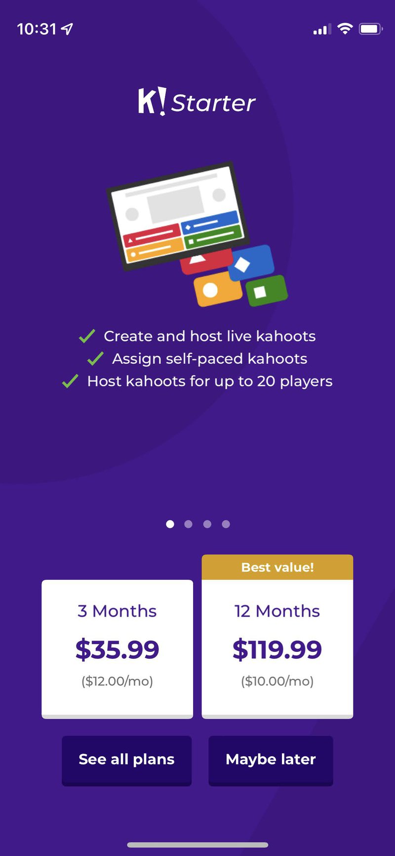
Kahoot!
The Kahoot! education app has a simple paywall with 2 horizontal buttons.
Comparison Table of Benefits
iHeart Radio
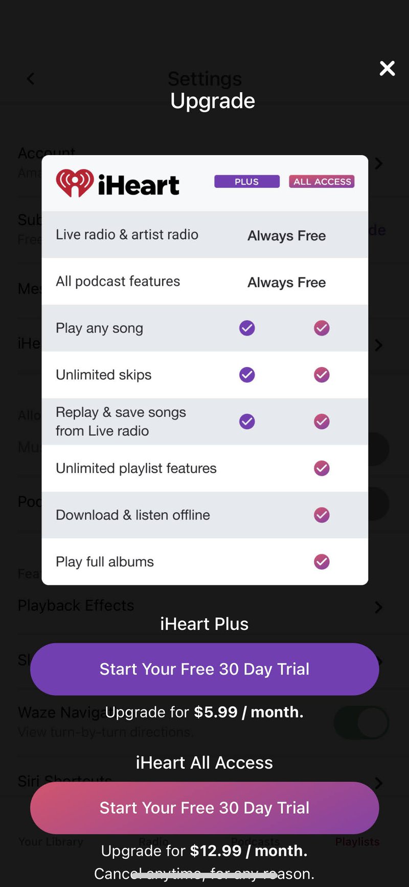
Popular music and podcast app iHeart shows a simple list with features for Free, Plus and All Access plans.
Weather Channel
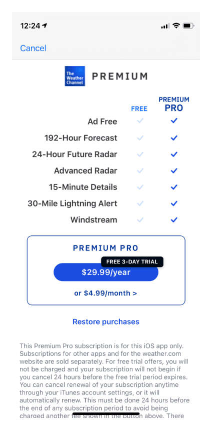
The Weather Channel app has a table of benefits to help drive people towards their paid plan.
Emoji
Show off your app’s playful side by using emoji accents.
Greg
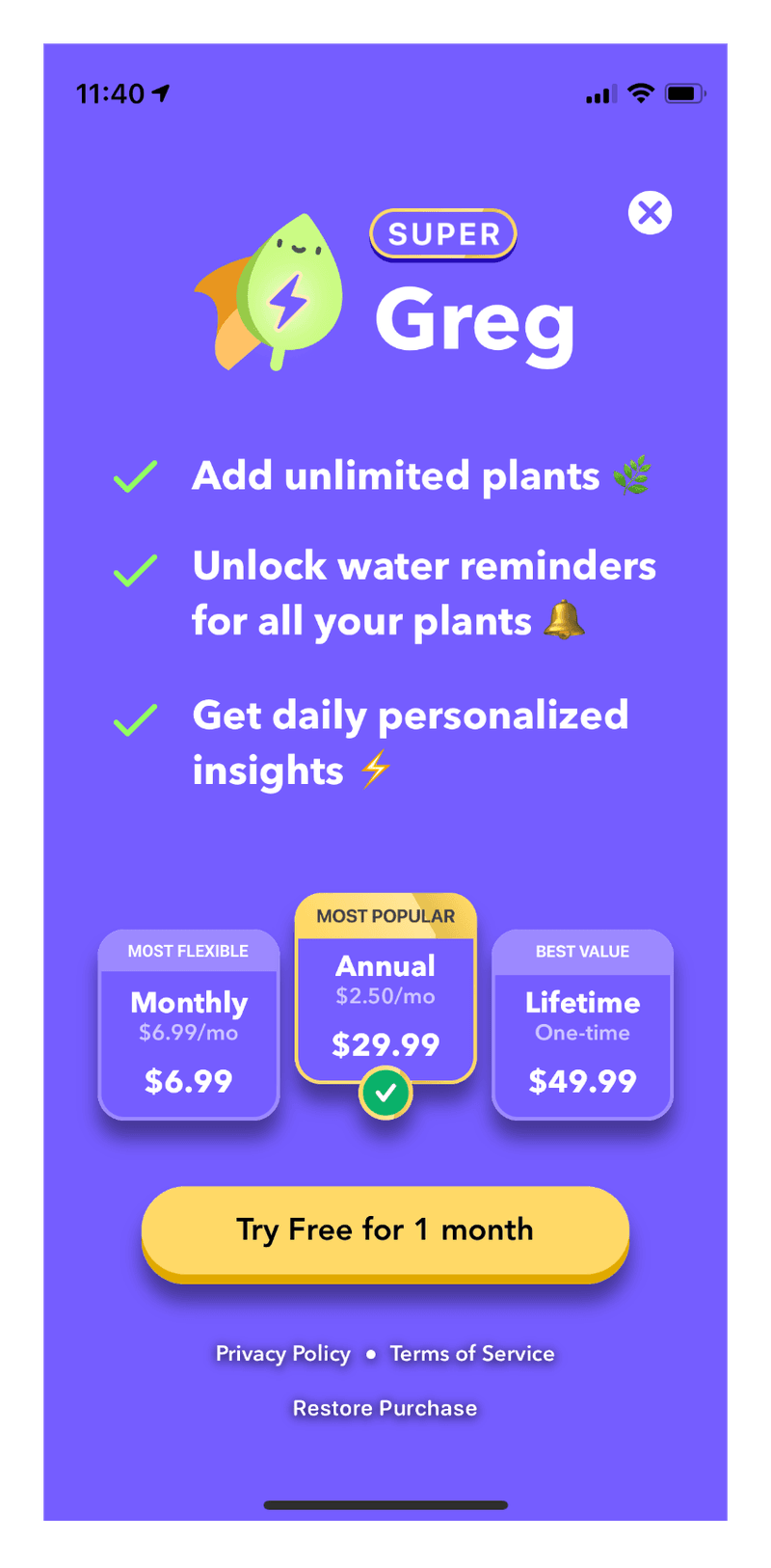
The Greg Plant Care app uses emoji in a list to help explain benefits.
Picking the right pattern for your subscriber journey
Patterns are starting points. The right one for your app depends on the moment you’re presenting it — a hard wall on first open is a different bet than a contextual upsell after a feature interaction. Nami’s no-code editor, Nami Designer, lets you design and ship multiple paywall variants without an app release, run them as in-context experiments, and tie the results back to the surrounding journey. See how it fits together, or talk to our team about which patterns make sense for your funnel.