

1. Calculate for Your Users How Much Their Plan Will Cost Monthly or Compared to Other Products
Understanding the true cost of a subscription plan is a critical factor for users when deciding whether to commit to a service. By calculating and displaying the monthly cost of a plan, users can easily assess its affordability within their budget. This practice not only enhances transparency but also helps users make informed decisions.
Additionally, comparing the monthly cost with an annual plan’s cost can highlight potential savings, making the annual plan more appealing. While they may not initially want to commit to a longer term plan, seeing clear savings can be compelling.
For example, if a monthly plan costs $10 per month and the annual plan is $100, users can immediately see that they would save $20 by choosing the annual option. This straightforward comparison can be a compelling incentive, as users often appreciate the opportunity to save money, even if it means committing to a longer-term plan.
While [users] may not initially want to commit to a longer term plan, seeing clear savings can be compelling.
Why Monthly Cost Matters
Most users think in terms of monthly budgets. Displaying the cost per month can make your product seem more affordable and easier to justify within their monthly expenses.
Implementation Tips
- Dynamic Pricing Information: Use tools like Nami paywalls that have Smart Text variables to automatically calculate and display monthly savings.
- Visual Comparisons: Use charts or graphs to visually represent cost savings between monthly and annual plans.
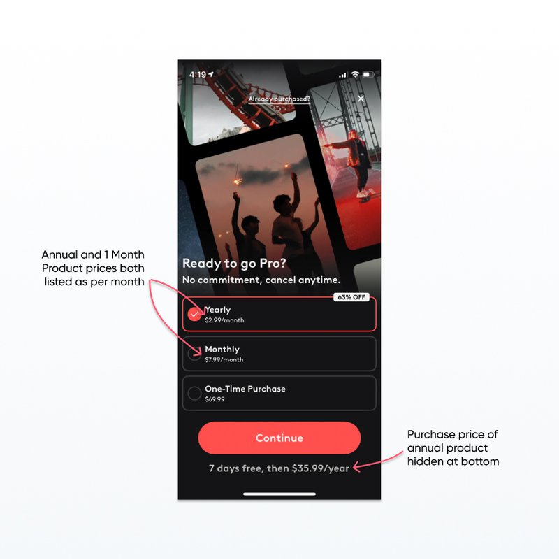
2. Don’t hide billing terms
While it can be tempting to just provide the price broken down by month, for an annual product users will be billed once every year, not monthly. So when the user is billed once for a larger amount than was advertised on the product (the monthly price), they will be surprised and upset. Being misleading about billing frequency can lead to support issues and refunds that are avoidable, violating paywall best practices.
👉Read more: Craft App Paywalls That Convert Users
Transparency Builds Trust
Transparency in billing terms helps build trust with your users. Misleading billing practices can not only lead to churn but also damage your app’s reputation.
Implementation Tips
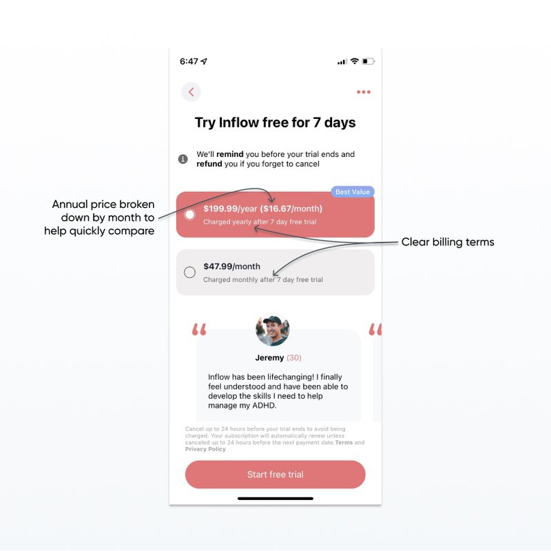
- Clear Billing Descriptions: Clearly state the billing frequency next to the price. For example, “Billed annually at $120 ($10/month)”.
- FAQ Sections: Include an FAQ section on the paywall that answers common billing questions.
- Visual Cues: Use icons or symbols to represent billing cycles clearly.
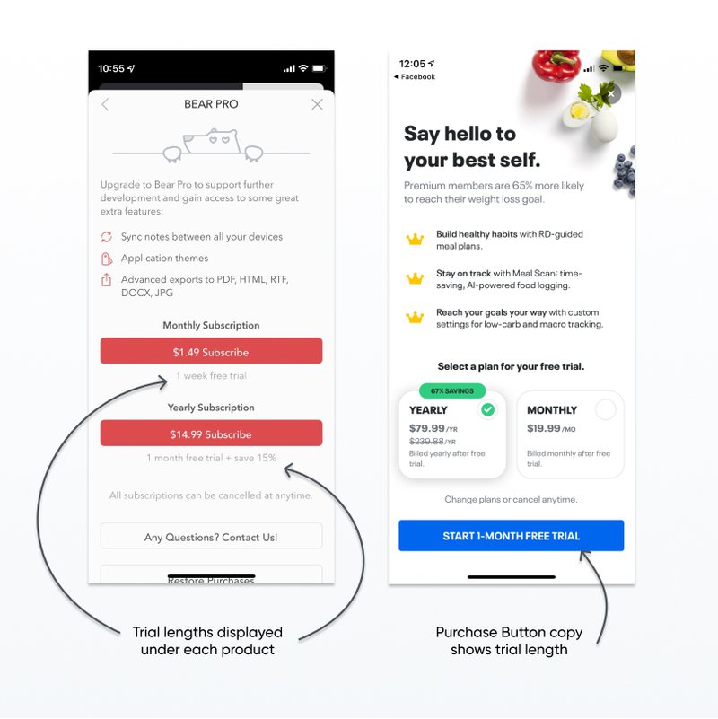
3. Clearly Indicate Trial Length
Users like to test out services before committing to purchase. Clearly indicating how much time they get in a free trial will help overcome buyer concerns and convert more users. This is a crucial paywall best practice.
If your products have different trial lengths, you should make that clear so that the user isn’t surprised. Unclear trial length is an easy way to get an unhappy customer or a refund request.
Overcoming Buyer Hesitation
Free trials reduce the perceived risk for users, making them more likely to try your service. However, unclear trial lengths can lead to frustration and mistrust.
Implementation Tips
- Trial Length in CTA: Incorporate the trial length into the Call to Action (CTA) button, such as “Start your 1-week free trial”.
- Countdown Timers: Use a countdown timer to show how much time is left in the trial.
- Reminder Emails: Send reminder emails towards the end of the trial period to prompt users to subscribe.
👉🏻 Read part 1: Best Practices for Paywall Design
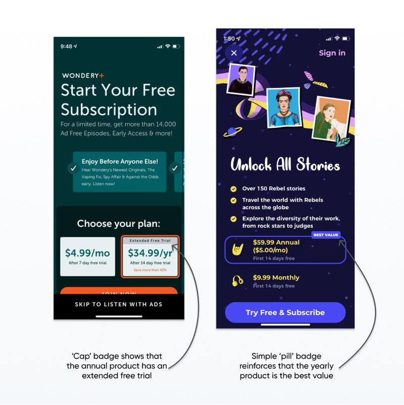
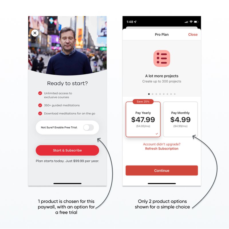
4. Use a Badge to Draw Attention to 1 Product
If your paywall has more than one product, try adding a small badge with color and text that helps draw attention to one particular product.
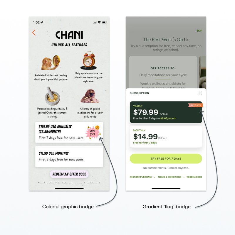
You can also include other text in a badge, such as highlighting ‘POPULAR’ or ‘BEST VALUE’ products or calling out free trials.
Guiding User Decisions
Badges can help highlight the most popular or best value product, making the decision process easier for users and driving them towards the option you prefer.
Implementation Tips
- Highlight Savings: Use badges to highlight savings, such as “Save 20%”.
- Social Proof: Use badges like “Most Popular” or “Best Value” to leverage social proof.
- Color Contrast: Ensure the badge color contrasts well with the rest of the paywall to draw attention.
👉🏻 Looking for examples of paywalls with product badges? The Nami paywall gallery has hundreds of paywalls from top apps to explore.
5. Don’t show more than 3 Products on a Paywall
Users are viewing your paywall from their mobile device and trying to decide if they want to pay for your service, and if so, how much and how often. While it is tempting to display all your product options in one view so that users have flexibility, rarely is this a good idea in practice.
Even if you do offer weekly, 1 month, 3 month, 6 month, and 12 month products, displaying them all on 1 small screen can give a user decision paralysis. They have to compare 5 different products and prices and try to decide how long they will want to use the service and whether they will remember to cancel.
Try setting up a paywall featuring just the annual product and track the conversion rate. Then test it against a paywall with both 1 month and 12 month options. How many users are buying the 1 month product versus the 12 month? How long do you retain the 1 month users?
**👉Read more: **20 Mobile Paywall Examples for Better Conversion
Avoiding Decision Paralysis
Too many options can overwhelm users, leading to decision paralysis where they end up not choosing any option at all.
Implementation Tips
- Limit Choices: Offer no more than three product options on the paywall.
- Highlight Differences: Clearly highlight the differences between the available options.
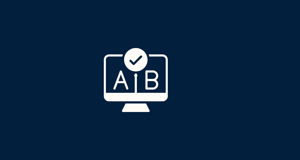
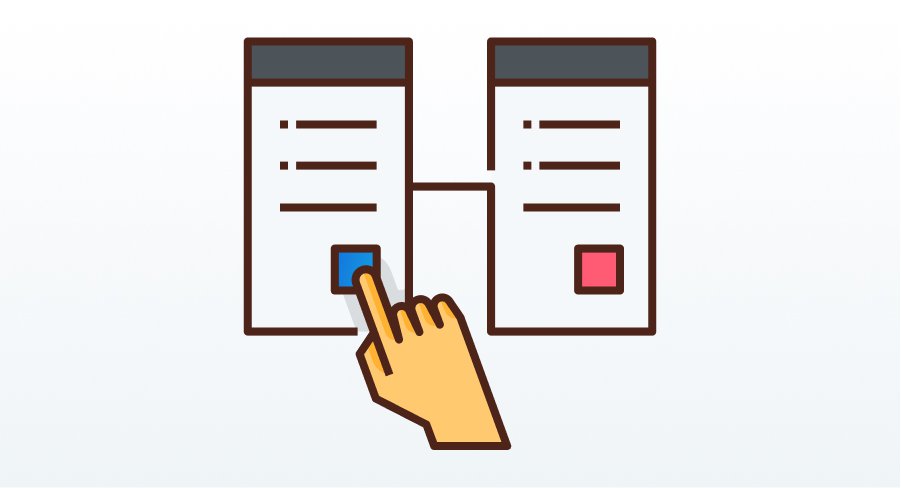
- User Testing: Conduct user testing to determine the optimal number of choices for your audience. With a software like NamiML you can run A/B testing for all your paywall in minutes.
👉🏻 Read part 3: Best Practices for Paywall Placement
Conclusion
Your mobile app paywall is a critical component in driving revenue. By following these paywall best practices, such as clearly indicating trial lengths, using badges to draw attention, and not overwhelming users with too many options, you can optimize your paywall for better conversion rates and user satisfaction.
Looking for more tips on paywalls? Submit your paywall for personalized advice from our team.