
- What priming-based onboarding actually is
- The trust-building sequence
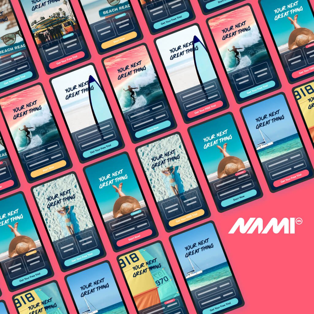
- The personalization quiz as a conversion tool
- The labor illusion: the final screen before the paywall
- Quiz results that sell without selling
- The paywall: capitalizing on everything you’ve built
- After the purchase: delivering on the promise
- Other primers worth testing
- The onboarding flow is the experience layer
- Sources
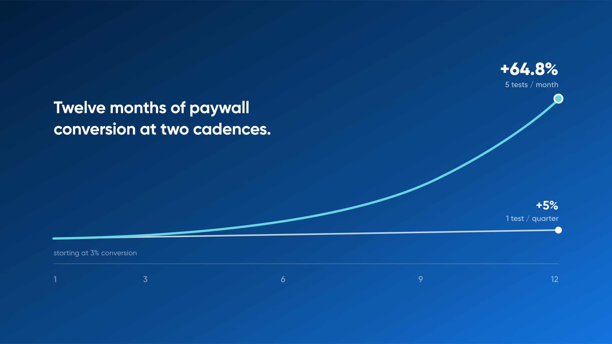
Subscription teams pour energy into the paywall, and rightfully so. It’s the screen where a free user becomes a paying one, and it earns every price test, headline swap, and button-placement debate it gets.
Across Nami’s customer base, 60% to 80% of subscriptions are activated during the onboarding flow itself, not on the paywall screen. The screens most teams treat as a product tour are doing some of the highest-impact conversion work in the entire subscriber journey. The apps with the strongest subscription growth use onboarding to prime subscribers, building trust, collecting intent signals, and psychologically preparing someone to buy before a price ever appears.
The approach has a name: priming-based onboarding. Here’s how it works.
What priming-based onboarding actually is
Most onboarding flows are designed around a single question: how do we teach the subscriber what our product does? Priming-based onboarding starts somewhere else entirely. It asks how to prepare a person, mentally and emotionally, for a purchase decision they haven’t made yet.
That distinction reshapes everything downstream. A product-tour approach treats onboarding as education. A priming approach treats it as the opening act of a conversion sequence, where every screen is doing psychological work that pays off when the paywall finally appears.
There are two halves to the practice, separated by a single moment. Before the paywall, the work is preparation: building trust, personalizing the experience, and getting the subscriber emotionally invested in an outcome they can already picture. After the paywall, the work flips entirely. The team’s job becomes delivering on every promise the onboarding flow just made, fast enough that no buyer’s remorse can take root.
The apps converting at the highest rates treat both halves as a continuous, designed experience. Not a tour, then a paywall, then a generic welcome screen.
The trust-building sequence

Before anyone enters payment information, they need to trust the app. That trust doesn’t materialize in a single moment. It builds in a deliberate sequence that moves from broad credibility signals to increasingly personal ones: universal trust first, then social proof, then individual personalization.
Universal trust comes first because it asks the least from the subscriber. These are signals from broader society or recognized authorities: scientific backing, known brand partnerships, industry certifications, media mentions. A fitness app citing peer-reviewed research on habit formation. A meditation app displaying its feature in a major publication. The unspoken claim is that you can trust this category of product before being asked whether you can trust this specific product.
Social proof narrows the lens from society to peers. Customer reviews, star ratings, testimonials, user-generated content, influencer endorsements. According to Gartner, 90% of buyers consider some form of social proof influential in their decision-making process. The format matters too. Adding human faces to these proof elements can increase conversion rates by up to 38%. A screenshot of a 5-star review feels abstract; a real person’s face next to a quote about how the app changed her morning routine reads as evidence.
Personalization is where trust gets individual. The subscriber moves from passively receiving credibility signals to actively participating in the experience. This is typically where the personalization quiz appears, doing double duty: collecting segmentation data the team can use, while making the subscriber feel seen.
The progression from impersonal to personal isn’t decorative. Asking someone to answer personal questions about their goals before any credibility has been established would feel intrusive. Earning trust first, through authority and social proof, earns the right to ask.
The specific trust signals that work
The trust-building phase draws from five categories, and the strongest onboarding flows layer multiple signals from each.
Social proof includes customer reviews, star ratings, testimonials, case studies, social media mentions, and influencer endorsements. Third-party validation covers industry certifications, awards, partnerships, affiliations, and media mentions. Transparency means visible business information, clear pricing, transparent trial timelines, plain-language privacy policies, and easily understood cancellation terms. Credibility shows up as recognizable branding, high-quality design, professional visual polish, and an active social media presence. Security and reliability signals include recognized payment provider logos, SSL certificates, secure checkout icons, and compliance notices.
Most apps lean on one or two of these categories. The highest-converting onboarding flows touch all five, because different subscribers respond to different triggers. The VP evaluating an enterprise tool cares about compliance and certifications. The consumer trying a wellness app cares about testimonials and faces. Cover the spectrum.
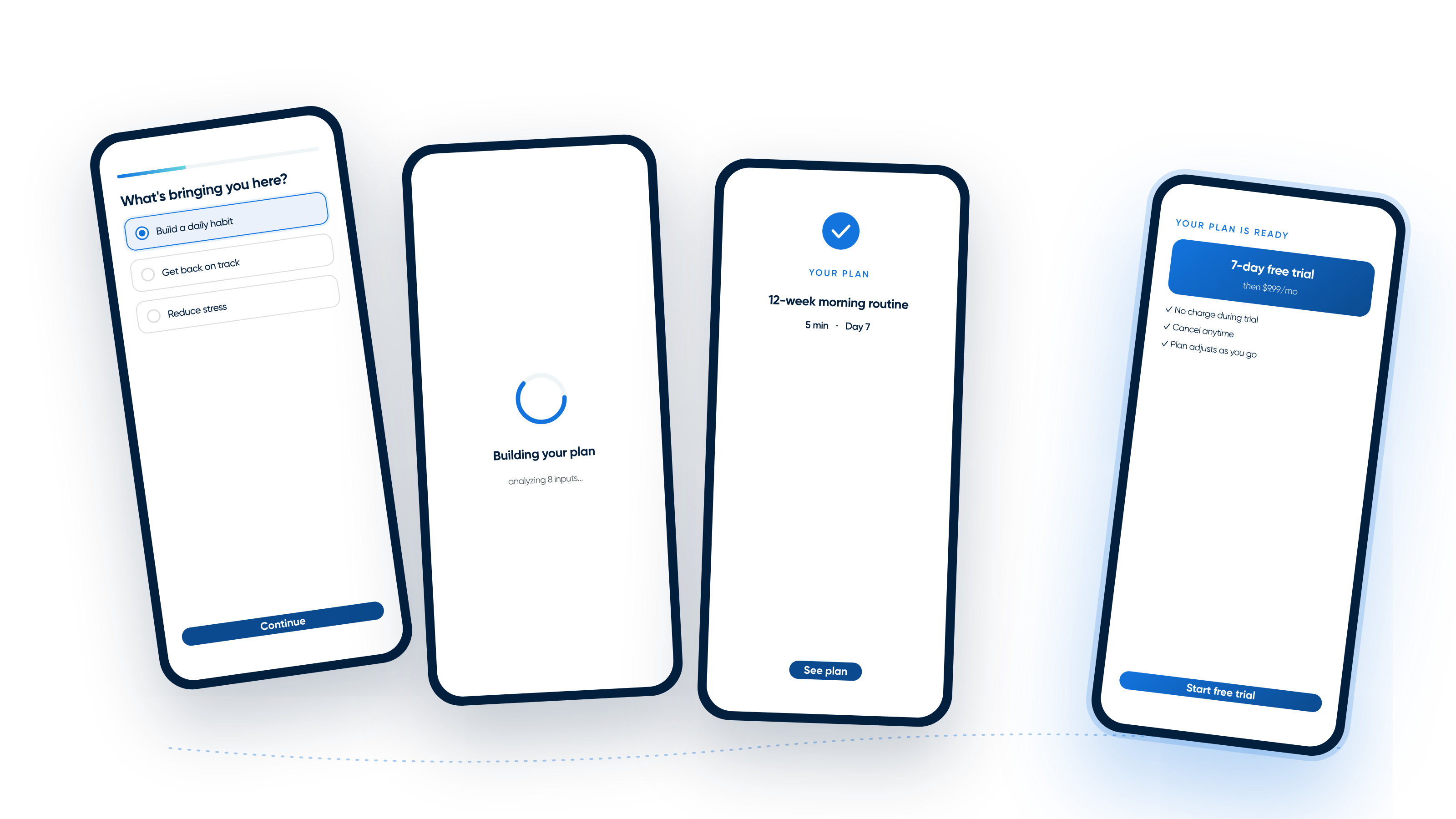
The personalization quiz as a conversion tool
The personalization quiz is the centerpiece of priming-based onboarding, and most teams underestimate how much work it’s doing. On the surface, it’s collecting information to tailor the experience. Below the surface, it’s overcoming objections, deepening emotional investment, and walking the subscriber toward a buying state of mind, one question at a time.
Three principles separate quizzes that prime from quizzes that just segment.
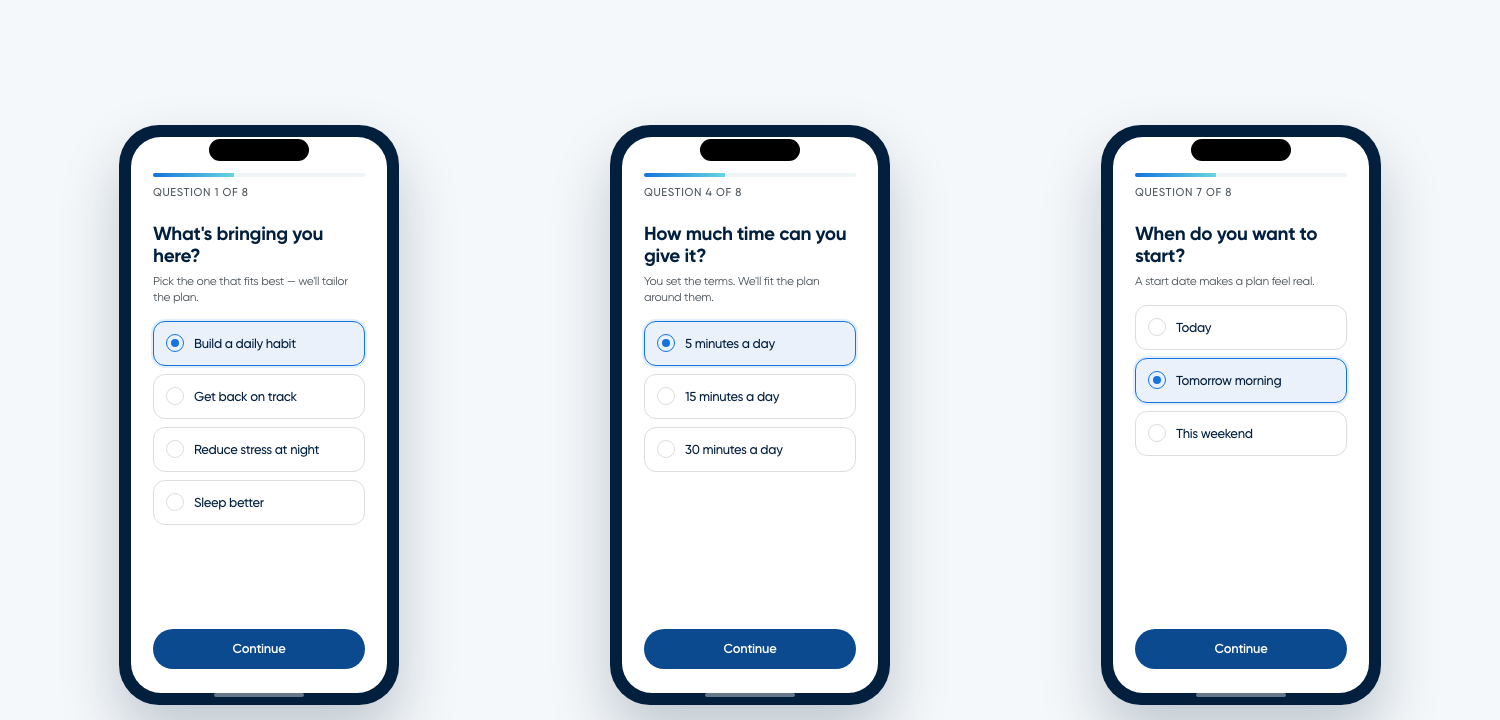
First, the very first screen should address the main pain point of the target audience. The subscriber downloaded the app for a reason. Naming that reason immediately tells them they’re in the right place. A fitness app shouldn’t open with age and gender; it should open with the goal that brought the person there: lose weight, build muscle, reduce stress. Recognition is the strongest opening move.
Second, the time objection has to be confronted head on. Lack of time is one of the most powerful psychological barriers in the modern subscription stack. It isn’t entirely rational; people simply feel busy. A quiz that acknowledges this with a question like “How much time can you dedicate? 5 minutes, 15, or 30?” does something powerful. It hands control to the subscriber. They subconsciously feel that they are setting the terms, which lowers resistance to commitment later.
Third, every screen should serve double duty. Each quiz question should both communicate value and overcome an objection. The time question isn’t just collecting a preference; it’s promising “this will fit into your life.” The goal question isn’t just segmenting; it’s saying “we have something for your specific situation.” Copy stays short. Each screen earns the next one only if it gives something back.
The best personalization quizzes feel like a conversation, not a form. The subscriber finishes feeling understood. That feeling is the priming.
The labor illusion: the final screen before the paywall
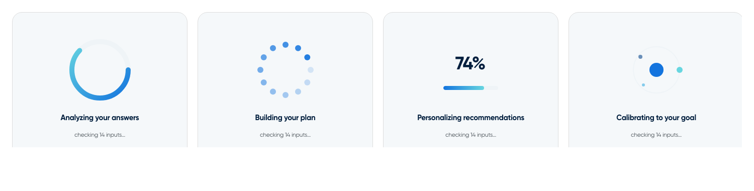
Between the personalization quiz and the paywall sits one of the more counterintuitive screens in the entire flow: a loading screen. The app doesn’t actually need to load anything. The screen exists because of a phenomenon called the labor illusion.
The labor illusion was documented in 2011 by Harvard researchers Ryan Buell and Michael Norton. Their finding: people prefer experiences where they can see visible “work” being done on their behalf, even when the work isn’t strictly necessary. In their study, users preferred a travel search engine that took longer to return results, with visible indicators of what it was checking, over one that returned identical results instantly.
The implication for onboarding is direct. After a subscriber answers 8 to 12 thoughtful questions, an instant result undermines the perceived value of the answers. A loading screen, deliberately displayed longer than technically necessary, with animated progress indicators and messages like “Analyzing your preferences” or “Building your personalized plan,” creates the impression that real computation is happening on this individual’s behalf.
The screen is intentionally extended because its job isn’t technical. It’s psychological. The subscriber should feel that their answers mattered. The result feels more valuable because it appeared to take effort to produce.
Quiz results that sell without selling
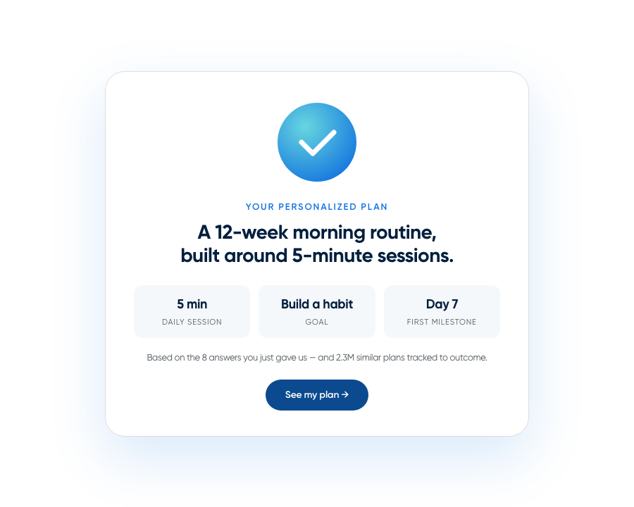
The quiz results screen is where priming reaches its peak. It’s the last moment before the paywall, and it’s doing two things at once: creating urgency and continuing to build trust.
Urgency comes from specificity. A generic recommendation (“Based on your answers, we suggest the Premium plan”) reads as a sales pitch. A specific result (“Your 12-week plan for building a morning routine, starting with 5-minute sessions”) reads as a prescription. The more personalized the output, the more the subscriber feels they’ve already started something they’d lose by walking away.
Trust continues building through three channels on this screen. The subscriber feels heard, because the results visibly reflect the answers they just provided. The solution feels credible, because it’s framed in terms of expert methodology or scientific reasoning rather than marketing copy. And social proof reappears, reinforcing that others with similar goals have seen results.
By the end of the quiz results, the subscriber’s internal narrative shifts from “I’m evaluating this app” to “this app has something for me.” That shift is what priming produces. It isn’t manipulation; it’s alignment between a stated need and a tailored response, so that the next step (seeing the paywall) feels like a continuation rather than an interruption.
A few apps also layer additional elements between the quiz and the paywall: short videos, interactive tutorials, or a preview of the in-product experience the subscriber is about to access. Used sparingly, these can deepen investment without slowing momentum. Used carelessly, they break the flow. Test them, but don’t lean on them as a substitute for the priming sequence itself.
The paywall: capitalizing on everything you’ve built
By the time a properly primed subscriber reaches the paywall, most of the conversion work is already done. The paywall’s job isn’t to convince. It’s to avoid losing the momentum the rest of the flow has built.
Three things matter here.
Visualize the promised result. The paywall should echo the language and imagery from the quiz results, reinforcing the personalized plan or outcome the subscriber just saw. Visual continuity tells them this is still the same experience, not a detour into a sales page.
Use pricing psychology deliberately. The word “free” remains one of the strongest triggers in marketing psychology. A free trial, when framed correctly, shifts the mental model from “should I pay for this?” to “should I try this for free?” That’s a fundamentally easier question. Lead with the trial; the price is supporting cast.
Address barriers before they become objections. Reassure subscribers that no payment will be charged during the free trial. Communicate, plainly, how easy it is to cancel. Transparent cancellation terms aren’t a concession to legal; they’re a conversion tactic, reducing the friction that causes subscribers to abandon at the last moment.
The highest-converting paywalls don’t feel like a hard stop. They feel like the next screen in a flow that’s been building toward this moment from the very first tap.
After the purchase: delivering on the promise

Priming doesn’t end at the paywall. The post-purchase experience determines whether the subscriber stays, and it follows its own three-step sequence: purchase confirmation, the promised land, and the aha moment.
Purchase confirmation is a single screen, sometimes called a rationalization block. Its job is immediate: reinforce that the subscriber made the right call. Congratulate them. Restate what they’re getting. Eliminate any trace of buyer’s remorse before it can form. The screen should read as a reward, not a receipt.
Right after confirmation comes the promised land, the experience that delivers on what the onboarding flow set up. If the quiz results said “Your personalized 12-week plan is ready,” then the very next thing the subscriber sees should be that plan, configured and waiting. Not a blank dashboard, not a settings page. The exact thing they were promised. Speed matters: every second between purchase and promise fulfillment is a second where doubt can creep in.
Then comes the aha moment, when the subscriber experiences the product’s core value for the first time. For a meditation app, that’s completing the first session. For a language app, understanding a first sentence. For a fitness app, finishing a first workout. The aha moment is what turns a transaction into a relationship. It’s the point at which the subscriber stops evaluating and starts using.
Teams that invest in priming-based onboarding but neglect the post-purchase sequence leave money on the table. A subscriber who converts and then churns in the first week is worse than one who never converted at all, because they’ve now associated your product with disappointment.
Other primers worth testing
A handful of additional patterns appear in high-converting onboarding flows and are worth testing alongside the core priming sequence.
Email capture before the paywall. The biggest drop in conversion happens at the paywall itself. Capturing an email address earlier in the flow, after the personalization quiz but before the paywall, creates a recovery mechanism for subscribers who don’t convert immediately. It also opens a growth loop: the subscriber can invite others, and invitees receive a personalized offer. The capture screen should feel like a natural part of the flow. Framing it around delivering results (“Where should we send your plan?”) converts better than a generic signup prompt.
Foot-in-the-door commitments. Named after the classic psychology finding that people who agree to a small request are more likely to agree to a larger one later, the foot-in-the-door (FITD) approach asks subscribers for a micro-commitment before the paywall appears. Some apps ask the subscriber to “sign a contract” committing to their plan, or to choose a start date. Whatever form it takes, the act of commitment reduces procrastination and creates a sense of motivation and ownership. The subscriber has shifted from passive observer to active participant. Active participants convert at higher rates.
Push notification priming. Most apps ask for notification permission with a generic system prompt and watch the opt-in rate languish. Better-performing flows precede the system prompt with a custom screen explaining what the subscriber will gain by allowing notifications: progress reminders, streak nudges, content alerts they actually want. The customer needs a reason. Provide one before the system asks.
Each of these tactics works because it deepens the subscriber’s investment before the paywall. The more invested someone feels in an experience they’ve started, the more friction they feel in walking away.
Priming-based onboarding is the practice of using the screens before the paywall to build trust, personalize the experience, and psychologically prepare a subscriber to purchase, so that by the time the paywall appears, conversion feels like a natural continuation rather than a hard ask.
The onboarding flow is the experience layer
Most subscription teams treat the paywall as the conversion moment and the onboarding flow as a product formality. Priming-based onboarding inverts that assumption. Conversion is a process, not a moment, and most of the psychological work happens on the screens before the price ever shows up.
The pattern across high-converting apps is consistent. A trust-building sequence that moves from universal credibility to personal relevance. A personalization quiz that simultaneously segments and primes. A loading screen that makes the result feel earned. Quiz results that create urgency through specificity. A paywall that capitalizes on everything the flow has built. A post-purchase experience that delivers on every promise the onboarding made.
This is the experience layer in action: the set of moments where subscribers actually decide whether to convert, stay, or leave, designed as an intentional system rather than a collection of afterthought screens. Subscription orchestration is the practice of designing, testing, and optimizing those moments across mobile, web, and CTV from a single system, without code. It’s how teams operationalize what was once left to gut instinct and static templates.
The apps winning at subscription growth aren’t the ones with the most aggressive paywalls. They’re the ones whose paywalls feel like a formality, because the onboarding flow already did the work.
Sources
- Nami platform data — 60–80% of subscriptions activated during onboarding
- Gartner — 90% of buyers influenced by social proof
- Buell & Norton, Harvard Business Review, 2011 — labor illusion study